Defining Anthropocene

Last month I was invited by Pacific Northwest College of Art’s Low Residency Creative Writing Program to participate in an EcoPoetics Workshop led by Allison Cobb, author of, “Plastic: An Autobiography.”

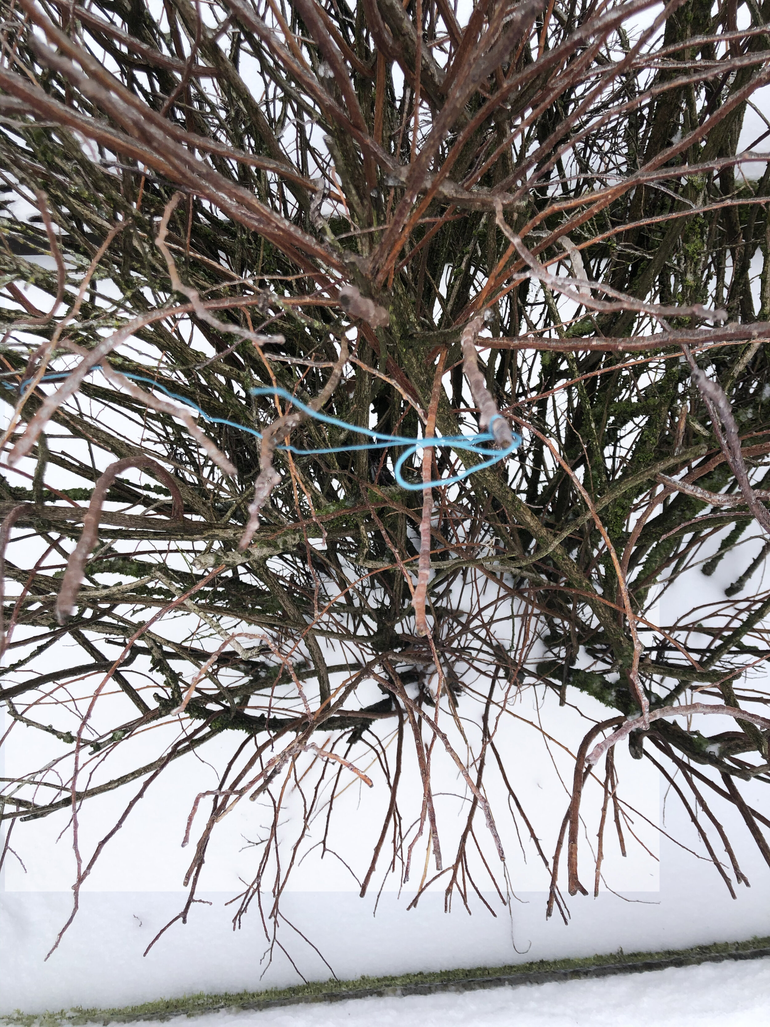
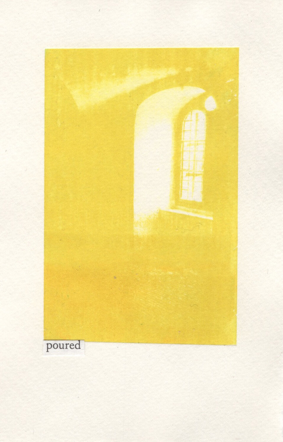
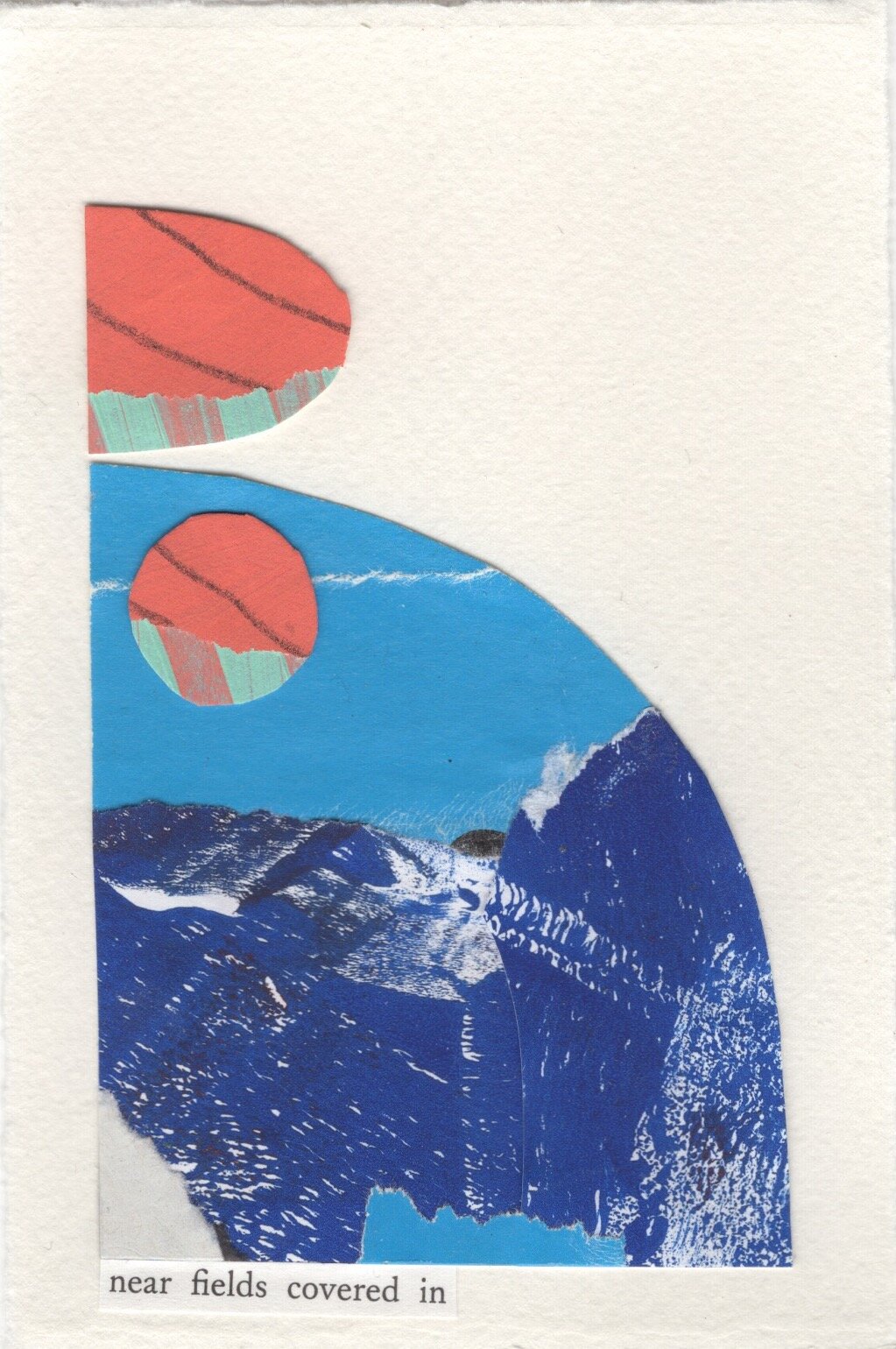
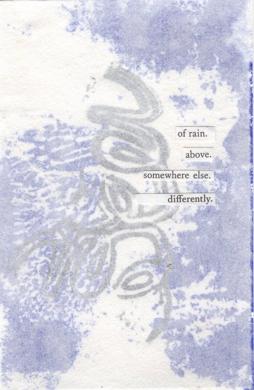
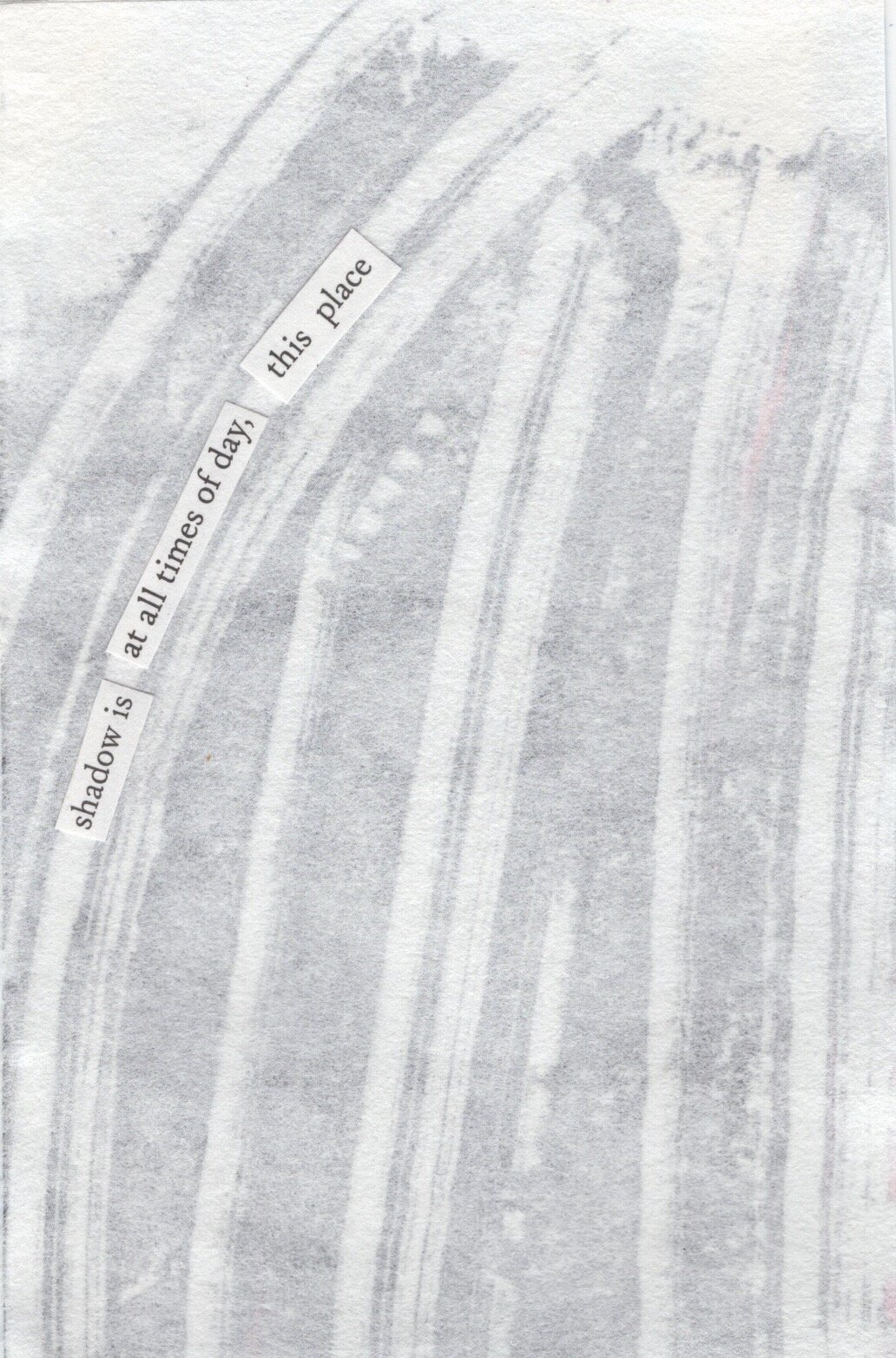
My definition of the word Anthropocene is Constellations of Scattered Bones & Hand Me Down Snippets, 2018, made mostly from beach collections

Prior to the class, I was asked to read Linda Russo’s “Counter Desecration: A Glossary for Writing Within the Anthropocene,” and to write my own definition of the word Anthropocene - a word I felt embarrassed to have never heard before.

Anthropocene Definition.jpg

Attempting to disregard my intimidation, I did a deep dive into Russo’s compiled glossary. I was comforted by the notion that this collection of curated definitions is presented as a guide of “roomy questions,” concerned less with answers and more with possibilities of uncovering new and future methods.

language: a living archive. A communal lung that holds and remembers all things through us. Made between our bodies, language lives everywhere. It travels and absorbs. A neural interconnectivity; the kinetic sensation is felt by all. It is composed of edges, imposes edges, but has no edges. It is a phenomenal organism, an extended nervous system that we all share. Capacious and metamorphic, infinitely adaptable, composed of and running through everything: all the meat of our bodies, this recyclable air, the earth and the universe that suspends it, all the physical spaces that contain us, and even all of the invisible, silent or silenced spaces where language rests, waiting for us to bring our attention through sound. Language absorbs all things: silt, soil, your ear against air, each word, earth against the mouth. To make room, in language, for language, listen closely. See repair.

-Counter Desecration: A Glossary for Writing Within the Anthropocene, Danielle Vogel*

Interdisciplinary artist, Christine Howard Sandoval’s practice is also a glossary of definitions that unpack cultural, economic, and social framings similar to how Russo pinpoints intersections across and within disciplines that determine ecological relationships.

Christine Howard Sandoval, (Left to Right), Land Form II- Diversion (diptych), 2018, Land Form III-Mother Ditch (diptych), 2019, Land Form I-Distribution (diptych), 2018, Adobe mud and graphite on paper, 52 x 40 inches on view at Disjecta Contemporary Art Center as part of the exhibition Timelines For The Future

Exhibited at Disjecta Contemporary Art Center as part of Timelines For The Future, Howard Sandoval’s glossary is defined by materiality, situated within the specificity of contested lands of Native and Hispanic heritage.

The multi-media passage of sculpture, video installation and mixed media drawings in the work of Channel trace the history of complex relationships between agrarian societies with riparian rights and land uses in the present; poetically using language to also identify a multiplicity of meanings that a word can hold simultaneously.

Still Image of Christine Howard Sandoval’s Channel 2017,  three-channel HD video with sound 7:43, taken during my visit to Disjecta Contemporary Art Center’s exhibition of Timelines For The Future, curated by Lucy Cotter

Still Image of Christine Howard Sandoval’s Channel 2017, three-channel HD video with sound 7:43, taken during my visit to Disjecta Contemporary Art Center’s exhibition of Timelines For The Future, curated by Lucy Cotter

My experience encountering Channel within a gallery space felt like an invitation to be still and present in Howard Sandoval’s movements: her meandering walk, witnessing the carrying and placing of found offerings, her running her hand against the surface of the land, all the while hearing her footsteps, the water beneath her feet. I listened to her calming voice narrate:

“ Without water there is no irrigation. Without irrigation the land will be lost. Without the land base the family will disintegrate and without family the community will die. Without community the language will be lost. Without language we do not exist.”

In the EcoPoetics Workshop, Cobb discussed questions of ethics, desire, grief, trauma and responsibility (response - ability, ability to respond); burrowing further into the meaning of language through nets cast by etymologies.

Excerpts of etymology research shared by Allison Cobb during an EcoPoetics Workshop, 2021

I was asked to respond and use my ability to collect plastic and to pair words with my findings - to speak about a method in prose poetry. Methods could be a point of view, a sound, an approach or theme, a story -maybe it is image and metaphor.

In searching for methods to define Anthropocene, I was reminded of the Danish artist group, SUPERFLEX (established by Jakob Fenger, Bjørnstjerne Reuter Christiansen and Rasmus Nielsen). In 2019 they exhibited a large scale site-specific installation, It Is Not The End of The World, flooding Cisternerne, a former water reservoir turned underground contemporary art venue in Copenhagen.

Me walking through It Is Not The End of The World, by SUPERFLEX at Cisternerne in 2019 ((click for video and sound snippet)

It Is Not The End of The World used language to make both a declarative statement and instigate curious reactions, begging the question: if it isn’t the end of the world, then what is it?

In visiting this exhibition, viewers like myself became active participants, wading through the dark halls in provided waterproof boots, experiencing a dystopian future not that unlike our present and imagining a world void of humanity, but not the end of the world itself.

In the center of the exhibition was an exacting replica of the executive toilets of the Bonn headquarters of the United Nations Framework Convention on Climate Change (UNFCCC), flooded with commentary on global consequences caused by human consumption.

Almost a year after wading through the Cisternerne, I found myself in Portland, Oregon, talking with Jay Ponteri, Director of Low Residency MFA in Creative Writing at PNCA and the one who invited me to attend Cobb’s EcoPoetics Workshop.

It was by happenstance that we met beyond the virtual world of our online classroom. Our chance encounter was also simultaneously an unexpected opportunity to collect leftover materials from former students, of which was ironically a copy of Colors Magazine, specifically #82, a 2011 fall edition on Shit: A Survival Guide.

(Left) the cover of Colors Magazine #82, Shit: A Survival Guide under a pile of dog shit in the snow, (Right) Pages 6-7 of Diarrhea in the first section of Danger: Biohazard

The entire edition is exclusively and thoroughly dedicated to the topic of poop - its many names, stigmas, dangers and underrated resources from different locations around the world. It cites that nearly two-thirds of the world, who have no toilet, must live intimately with shit.

Colors Magazine #82, Shit: A Survival Guide, pages 44-45 from the chapter, Do-It-Yourself, referencing the work of Dr. Kamal Kar and the Community-Led Total Sanitation Foundation

A complicated aspect of defining Anthropocene is its entanglement with social and economic systems such as but not limited to capitalism, classism, settler colonialism, and systemic racism. Ten years later, Colors magazine could very well make an updated survival guide substituting the word shit for Anthropocene.

Yet, reducing a complex definition to a smelly pile of feces is about as paralyzing as the (valid) feelings of helplessness and grief that often results from discussions centered around climate change and environmentalism. Rather lets refer back to Linda Russo’s glossary. See repair.

repair: begin with what you have. Here, a clutch of syllables tied with blue string - carnation, elderflower, gardenia, thyme, and thistle. A white candle. A ring of hair. Ink. Let it warp. To gather all absences through a door in a tongue. Silence to sound to skin, to restore all things. See language.

-Counter Desecration: A Glossary for Writing Within the Anthropocene, Danielle Vogel*

Using Vogel’s definition of repair, I attempted to start with what I had. At the time Portland was experiencing a snow and ice storm and Portland General Electric was reporting at least 4,000 power lines down, leaving tens of thousands of people without power (myself included).

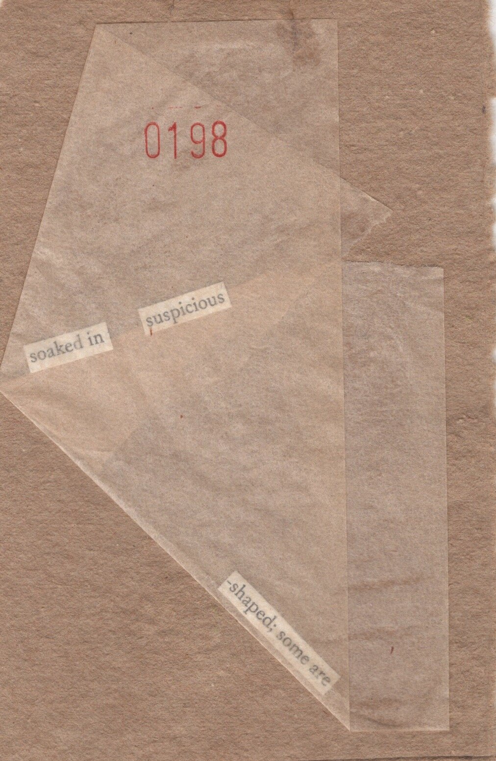
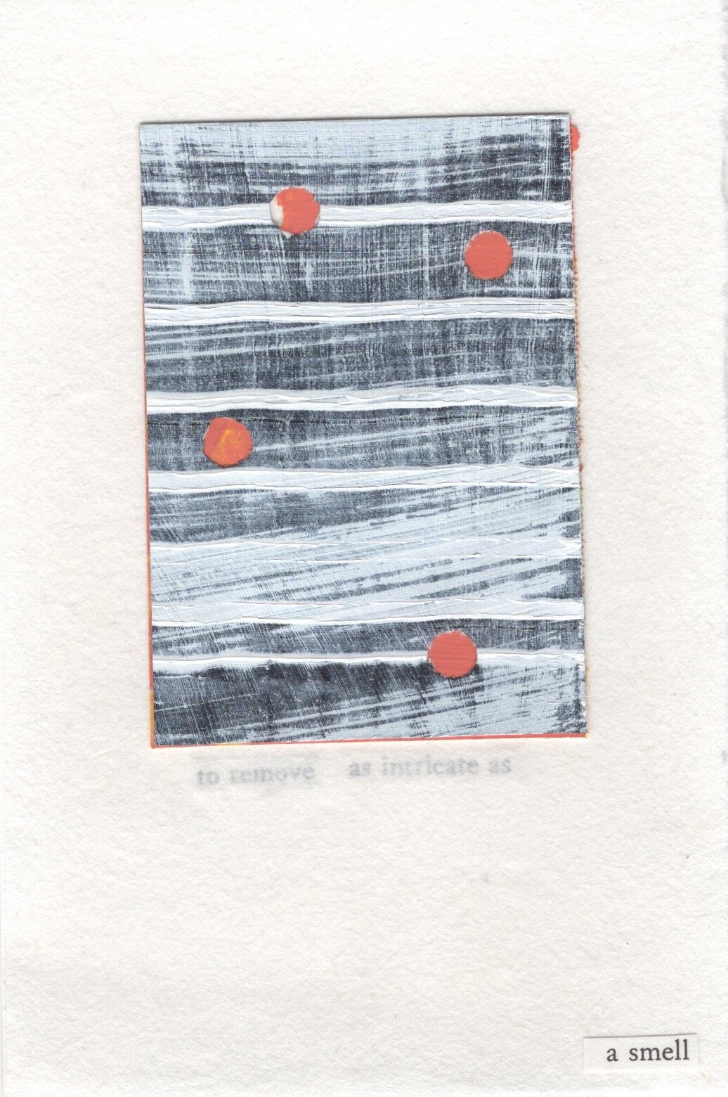
Wearing extra layers and taking cues from the late Dadaist, Tristan Tzara’s chance instructions on composing poetry, I took my copy of Shit: A Survival Guide and began to cut out text, rearranging them in a new order.

These words live in my latest installation, Sentences I Keep Near, forming a different type of survival guide.

Sentences I Keep Near, mixed media, 2020-21

*Edit 7/9/22 It has come to my attention that I incorrectly cited Linda Russo as defining language and repair While Russo compiled the glossary, these definitions were written by Danielle Vogel.Counter Desecration: A Glossary for Writing Within the Anthropocene,” is a collection of ecopoetic definitions by a collection of various contributors.

Unpacking & Color Coding

On my last class of my first semester of grad school, I heard the same phrase (in so many different words) that I’ve heard all term, “I feel sorry for how robbed you are of this experience.”

When contradictory feelings overlap

As I write this I’m looking through my collection of polaroids. It is Christmas and there are only 6 days left of 2020. I am still unpacking (in all of the literal and figurative ways you can imagine) from both an international move last summer and the many tragedies of this infamous year.

These polaroids, a timeline of: pictures, portraits and portals are a color code of what can be pictured and not pictured.

Yes, you should always have multiple pairs of scissors

Mary Ruefle color codes sadness in her book, “My Private Property.” Blue, purple, gray, black, green, yellow, orange, red, brown, pink, white. In no particular order they are each their own sadness.

Gray sadness is the sadness of paper clips and rubber bands, of rain and squirrels and chewing gum, ointments and unguents and movie theatres. Gray sadness is the most common of all sadnesses, it is the saddness of sand in the desert and sand on the beach, the sadness of keys in a pocket, cans on a shelf, hair in a comb, dry-cleaning, and raisins. Gray sadness is beautiful, but not to be confused with the beauty of blue sadness, which is irreplaceable. Sad to say, gray sadness is replaceable, it can be replaced daily, it is the sadness of a melting snowman in a snowstorm.

p. 46, Mary Ruefle, “My Private Property”

Yet (spoiler alert) hidden in the last sentence of the last page under acknowledgements, Ruefle also notes, very slyly, that the word happiness can be substituted for the word sadness and nothing changes.

How does this work?

Is gray sadness the same as gray happiness?

I’ll try.

Gray happiness is the same sadness as an invisible horizon line- sea becoming sky and sky becoming sea. It is ferris wheels on rainy days and second hand buildings selling second hand chances. It is the questions you ask yourself when you are watching strangers shop. Which people donate the chances and which people take them? Gray sadness is the same happiness as the gate blocking your view of the city at the top of the historical Rundetaarn (round tower) observatory.

It is the gray patch of paint used to hide graffiti that resembles the shape of a rectangle, but will never be a true rectangle and the wall will never be the way it was before. Gray happiness is the same sadness of the trick of mirrors reflecting the clouds as if they were living inside a room for Magritte, but knowing the truth of it is that they are always out of reach. Gray happiness is the same sadness as Notre Dame before her fire.

According to Ruefle these gray feelings are replaceable. So what makes blue feelings so irreplaceable?

Blue excerpts from Why Art? by Eleanor Davis

I’ve already mentioned in Parisian Doors & Color Histories, how Maggie Nelson wrote an entire book, “Bluets,” dedicated to the color blue. For just under 100 pages, Nelson’s prose chart literary histories and relationships in objects, locations and songs in a numbered list from 1 - 240.

Is blue irreplaceable?

My collection of blues are my own snapshots. You see the clouds parting above the tiled roof, but I don’t expect you to know about the argument that was building behind it or the quality of the quiche lorraine and conversation below the umbrella in a crowded courtyard. The same way you wouldn’t have guessed that a blue box of matching pots and pans was my clue to finding my way back from a detour on a cold day lost in Copenhagen.

Blue is the repetition of the striped portrait in Trier years after having painted a portrait of the same person wearing stripes, sitting in a striped chair in the suburbs of Mint Hill, North Carolina. Or the crisp air of fresh snow in my old neighborhood in Gonderange, one of the few places I have lived where you still have to go to work on a snow day.

It is the reflection of water underneath Lorenzo Quinn’s Building Bridges, (2019) sculpture of oversized pairs of hands arching over the Arsenale’s waterway in Venice and the icy cold temperature of the lake after sweating from hiking only halfway up a mountain in Switzerland.

Blue is walking on the land of past tragedies now presented as painted bridges between one’s own legs or labyrinths of sorrow encased in cement columns stretched out for as far as you can see. It is in the fragile tension of “elemental choreography of aerial theatre” presented in Tomás Saraceno’s Disappearance of Clouds, (2019) and is the unexpected hiss of a swimming swan or the amount of trinkets you can shove under a tent at a Sunday flea market in Vienna.

Blue is wearing out your shoes to finally reach the base of the Eiffel Tower and wishing you could have spent more time in Aldo Rossi’s domed (space ship) tower at the Bonnefantenmusem on your Tuesday afternoon.

Black happiness can be found in a collection of silhouettes, outlining horizon lines, bridges, Cologne’s famous gothic cathedral and the Parisian clock at the Musée d’Orsay. They are shadows dancing with time. What sound might they make?

Poet & painter, Etel Adnan’s most recent book, “Shifting the Silence,” talks about shadows, sounds and time.

“Yes. The shifting, after the return of the tide, and my own. A question rushes out of the stillness, and then advances an inch at a time: has this day ever been before, or has it risen from the shallows, from a line, a sound?

…A particular somnolence takes hold of you when the shadows start growing. Then, the heart creates different beats. You want to touch the leaves, look intensely at each tree. The night falls, already tired, already bare.”

-Etel Adnan, Shifting the Silence

I suppose green happiness is Middle Eastern palm trees, the Witte Huis in Rotterdam, one of the few buildings to survive the bombing of World War II and Vianden Castle, dating from the 10th century, fully restored after a long history of abandonment and ruin.

Green sadness is retired signage, the amount of time it has been since i’ve seen my sister and the city I said good bye to after almost two years in Europe.

Green happiness is the color of leaves shining in the sun, the Palmenhaus Schönbrunn greenhouse, with it’s spiral staircase and Japanese pear trees from my new backyard or the day my friends got married and having an entire vacation with my parents to myself.

Yellow happiness is the same sadness of sitting in the sun on your golden birthday drinking lemonade when a bird poops on your head. It is the reflections in the canal, umbrellas, and restaurants by the waterfront in Nyvan that provide outdoor heating and blankets or cubed buildings in Rotterdam that you can tour if you are into that sort of thing. (This was all pre-covid of course.)

Yellow happiness is the same sadness of finally meeting your friend’s baby after 9 months and only getting to know her for a day and a night. (This was not pre-union striking in France.)

Yellow sadness is the same happiness when it is your last day in France or the small town of Ptuj in Slovenia. It is touring your grandad’s 4k+ beer glass collection, knowing it is now being packed up and sold or your first (film) selfie on your fifth anniversary after eating ice cream on a not so warm day.

Yellow sadness is the same happiness of faded buildings and sunshine filtering through the Musée d’Orsay’s many windows.

While red happiness is the bustling Carmel Market in Tel Aviv, round-a-bout, center-of-the-road poppies, stripes and French bistro chairs. It is Alexander Calder’s “Eagle,” at Olympic Sculpture Park, a European motorbike and the leaning canal houses of Amsterdam.

Red happiness is house boats with jacuzzis, retro volvos, fruit stands, salvaged type, faux windmills and the last christmas we spent with the legendary Carl Holt.

Red happiness is vintage tin containers at the Waterlooplein market, red Parisian doorways and outdoor café seating (back when people used to sit close together). It is brightly painted homes in the neighborhood village, international dog-sitting in Vienna and retro Beetles that are probably really difficult to drive.

Pink sadness are cotton candy like blooms swaying in the wind on your walk home from the gynocologist. They are the lifesize dollhouses you could only admire from the sidewalk or the roses that cheered you up when you were crying in public.

Pink happiness is the Majolikahaus, designed by Otto Wagner. It is the greeting of a friendly mascaron at your doorway or the blooms of Spring matching the neighbor’s house.

Orange happiness is the Hundertwasserhaus and the rejection of straight lines, pumpkins at the Torvehallerne market, sunflower patches and golden frames next to hanging chandeliers.

Orange sadness is the color of the sky during wildfires and sculptures that die after a site specific installation ends.

While white happiness is the first snowfall in a new city, Clervaux Castle, housing the permanent exhibition, “Family of Man,” curated by Edward Steichen, Rundetaarn Tower’s many “hidey holes” and happy accidents within double exposures.

White happiness is the view from behind Mudam, touring the Ptuj Castle, new Spring blooms and finally finding the Jean Dubuffet sculpture at the Louisiana Museum Sculpture Garden - which is strategically hidden in the courtyard only accessible through the café.

White sadness is fog hiding your view of the Eiffel Tower and running out of film. It is the same happiness of finding the trailhead after getting lost on backwoods gravel roads, dodging potholes and eating a donut after hiking for seven miles.

White happiness is the same sadness of a new holiday tradition when you can’t be with your friends and family except through screens.

Sitting in Strange Times

In the last several weeks, the frequency of sitting behind screens has inevitably increased as a result of lockdown and shelter in place restrictions around the world.

Too much screen time, 2020

Last week I found myself watching a documentary of the Vitra Design Museum’s expansive chair collection called, “Chair Times.” It felt appropriate in this strange time to willingly go down the infinite rabbit holed history of chairs and their varied seats.

What fascinates me is that (chairs) have personalities. Each of them tells us something about the time it was created in, about the person who designed it, and of course about the society that utilized this particular chair. And also the fact that they’re basically all the same; that they are all an invitation to have a seat, that they’re all small sculptures make them comparable. This allows us to illustrate an era.

- Rolf Fehlbaum, Chairman Emeritus of Vitra

The documentary begins with a focus on bentwood chairs designed by the innovative cabinet-maker, Michael Thonet (1796 - 1871).

Currently behind the closed doors of the MAK Museum in Vienna is the exhibition, Bentwood & Beyond, Thonet and Modern Furniture Design.

Last year when I visited the exhibition, I learned that bentwood furniture is not a Viennese invention, nonetheless, the bentwood chair is most well-known as the “Viennese Chair.”

The center aisle of the gallery displays each chair’s unique silhouette projected onto translucent screens; brilliantly allowing you to focus on the overall form before fussing over the details.

In a conversation between curator, Serge Mauduit and Vitra Design Museum Director, Mateo Kries, they discuss how the Industrial Revolution and the societal development of the 19th century contributed to the emergence of a middle class and therefore a middle class public life.

“What interests me is the public aspect. Suddenly, furniture is designed for public space.”

-Mateo Kries, Vitra Design Museum Director

Fast forward to 2020, when public space becomes eerie and vacant.

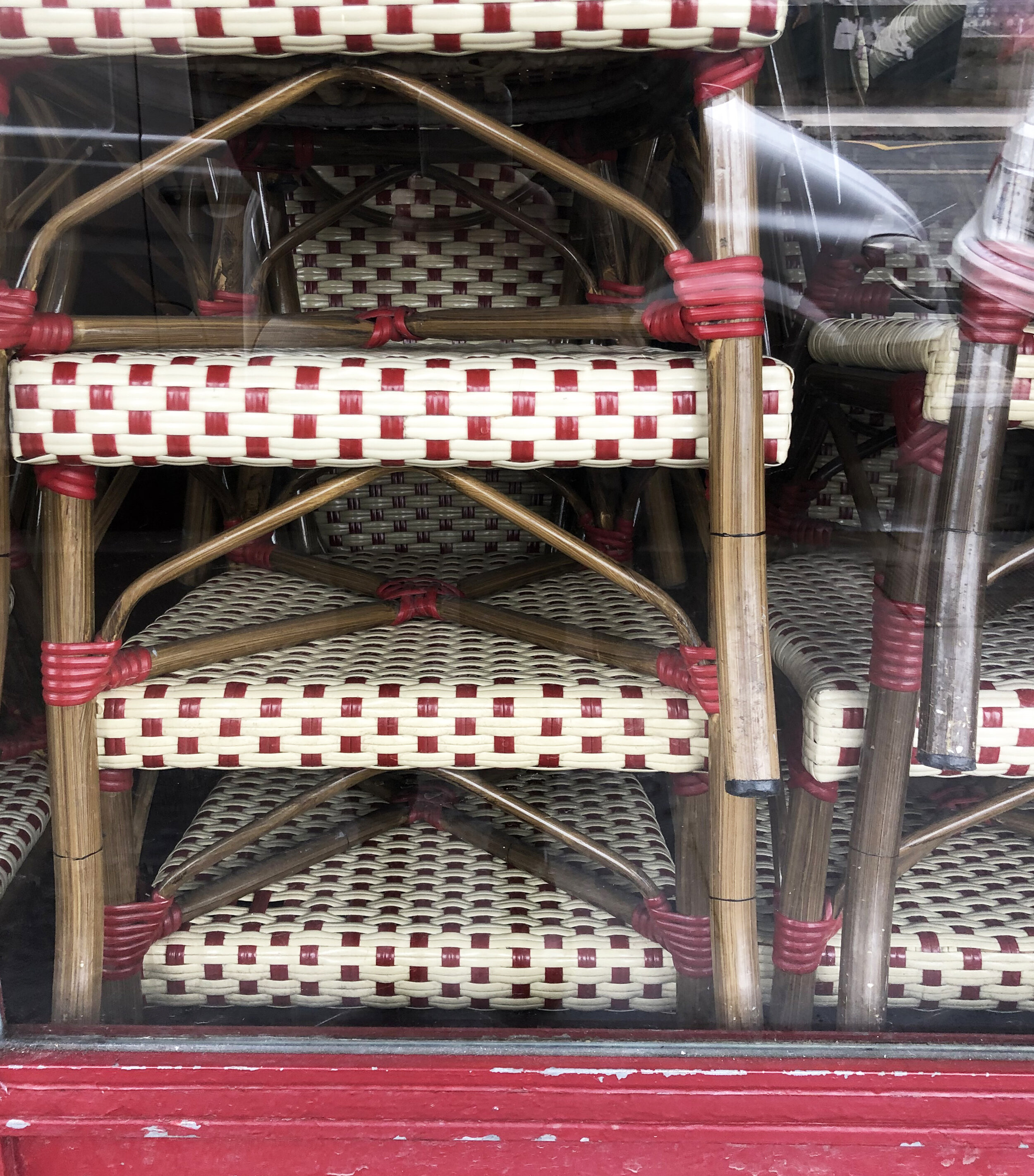
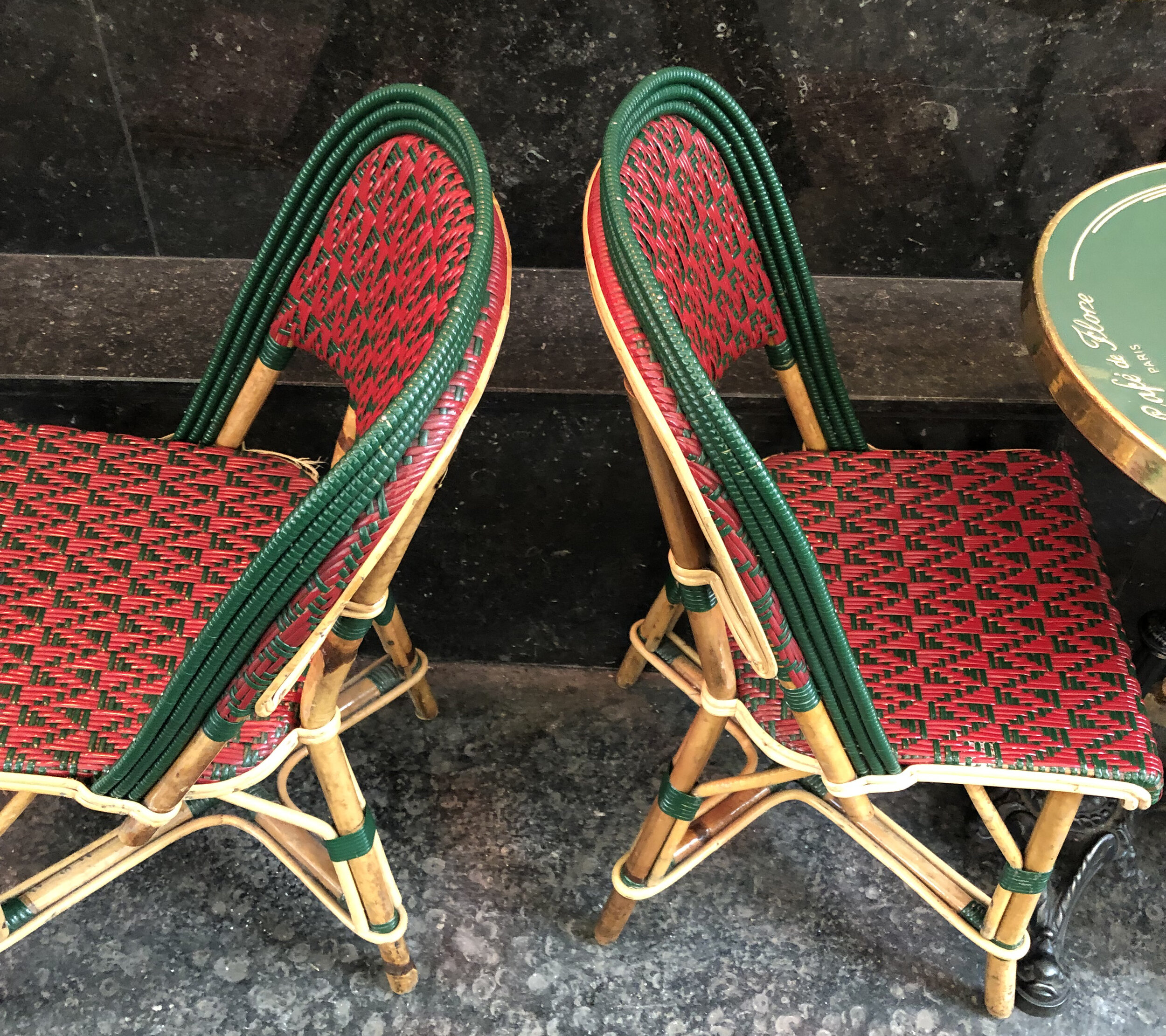
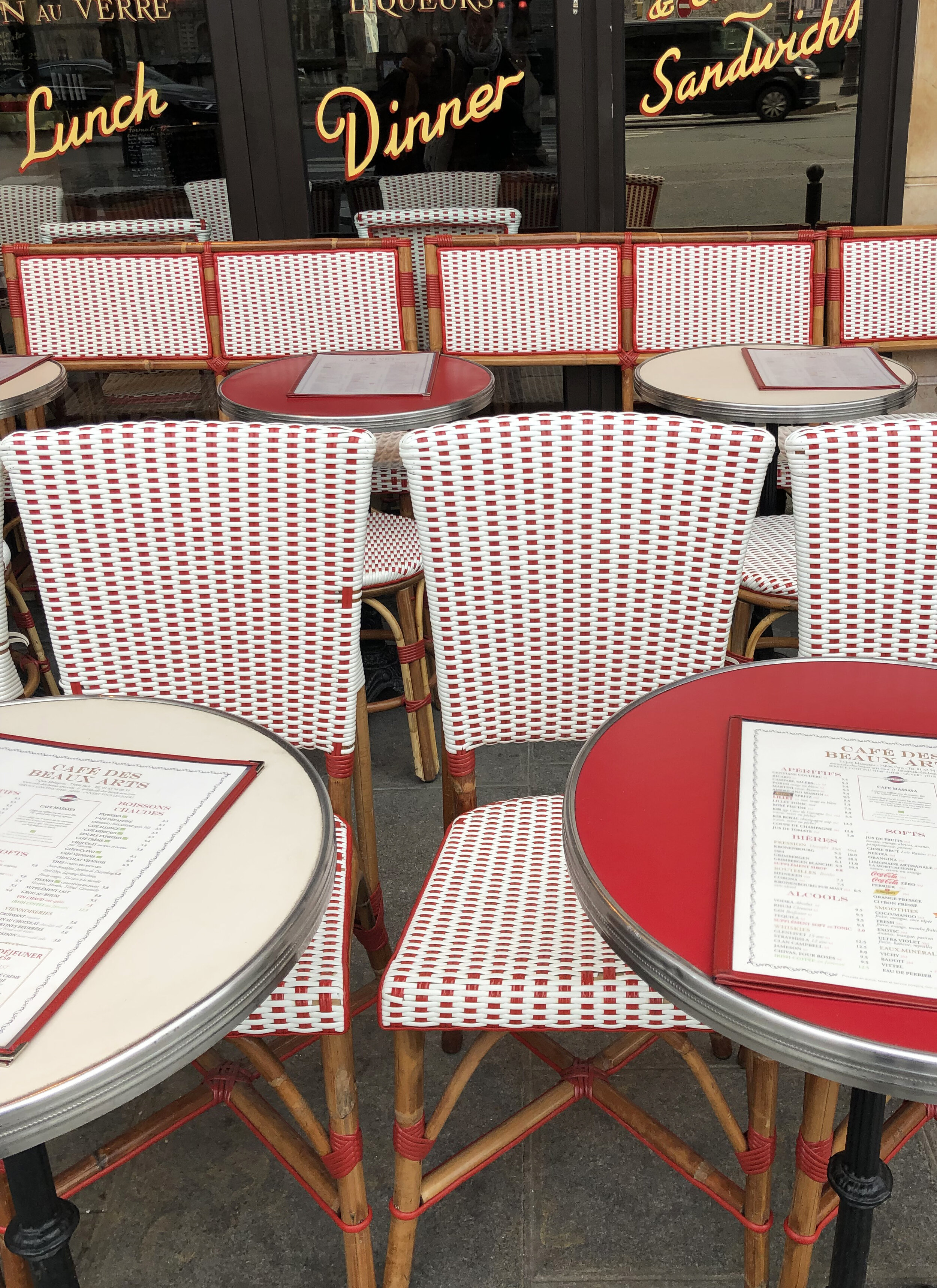
This collection of Parisian café chairs was captured back in February of last year, when sitting close to people felt annoying, not nostalgic.

Similar to Masion Gatti proudly producing their chairs by hand, Danish design also emphasizes old school techniques and craft as good quality versus a mass produced object meant to be sold at a lower cost.

The Danish Chair An International Affair is a permanent collection at the Design Museum Danmark. Exhibited beautifully in a tunnel display of stacked chairs, is a collection of 110 chair classics with an emphasis on Danish Modern design.

“The chair is the piece of furniture that is closest to human beings. It touches and reflects the body that sits on it with arms, legs, seat and back.”

-Exhibit Curator, Christian Holmsted Olesen

Chair Tunnel, Design Museum Danmark

An innate element of Danish furniture is simplifying antiquity. Much of the Danish modernist approach was a combination of functionality and craft tradition as well as the result of collaborations between architects and cabinet makers.

Klismos chair, on the stele of Xanthippos, Athens, ca. 430-20 BCE.

Many Danish designers rediscovered the Klismos chair, a type of ancient Greek chair, with curved backrest and tapering, out-curved legs. This inspired reinventing different versions of frame chair designs - a type of chair with a top rail surrounding a person who is seated.

In architect, Witold Rybczynski’s book, “Now I Sit Me Down: From Klismos to Plastic Chair: A Natural History,” Rybczynski explains that in ancient Greek art, the Klismos chair is represented as more democratic than a throne or symbol of status.

Rokoko Chamber, State Room at the Albertina Museum

Yet, in most cases throughout history, a chair portrays a status or identity and is often reserved for the elite. This is evident in the State Rooms of The Albertina Museum, a former palace that was once the residence of the Habsburg archdukes and archduchesses. 

I’m typically more fascinated with a used chair. A favorite pastime of mine is scavenging for the rejects - the “one’s trash is another’s treasure”, side of the road or flea market gem.

Through this process of hunting and gathering, chairs became a reoccurring theme in my own artistic practice.

Chair Series II, 2011

Largely inspired by artist, Robert Rauschenberg’s “combines,” I began investigating the relationship of painting to sculpture by deconstructing everyday objects.

Chair Series I, 2011

Similar to how people say that pets resemble their owners, I felt the need to discover the relationship of a chair to a person. How do their frames compare?

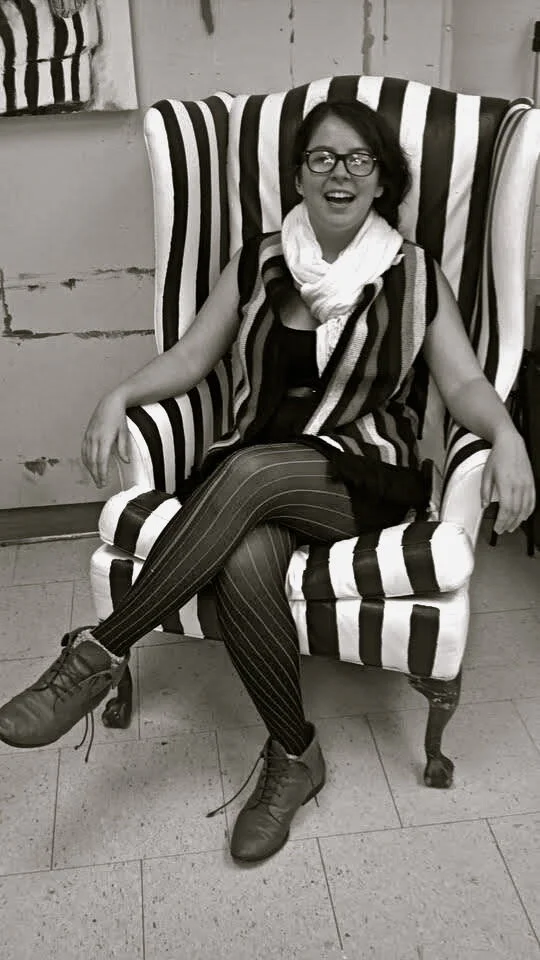
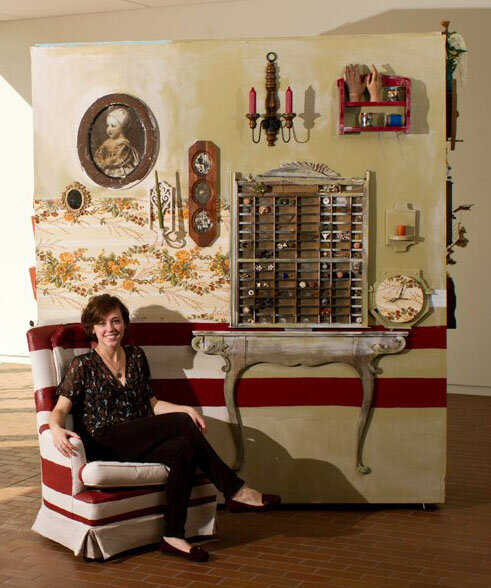
Looking again to masters before me, I fashioned my own “Alice Neel Chair” by repurposing a used chair in painted stripes, inviting willing participants to sit for me.

Self Portrait, 1980, pg. 252, Alice Neel Painted Truths

During this process, I was also very preoccupied with various presentations of chairs and the concept behind the installation titled, “One and Three Chairs,” by artist Joseph Kosuth, which compares an object, an image and words as representations of a chair.

Josef Kosuth, One and Three Chairs, 1965 (photographed at the Centre Pompidou in 2019)

This resulted in a repetitive series of paintings depicting seated portraits, and then hanging the painting of the person sitting in the chair behind them while they sat in the actual chair and had their picture taken.

As the series evolved, I lost interest in the figure and focused fully on the chair itself, examining it’s relationship to interior and exterior site- specific locations.

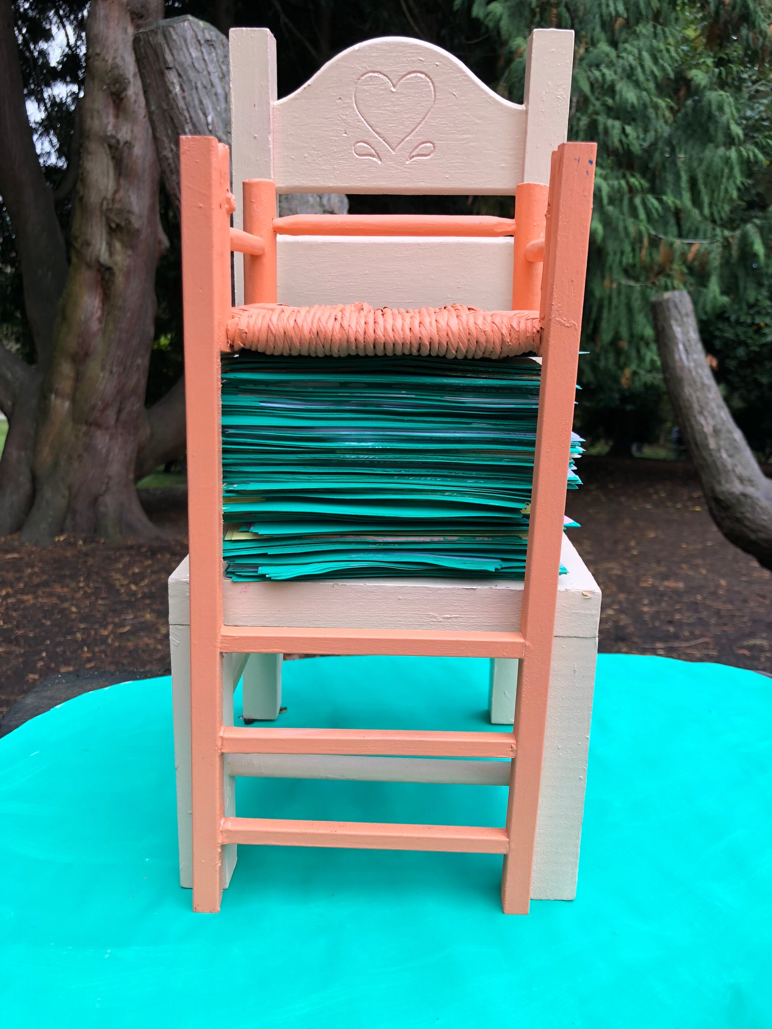
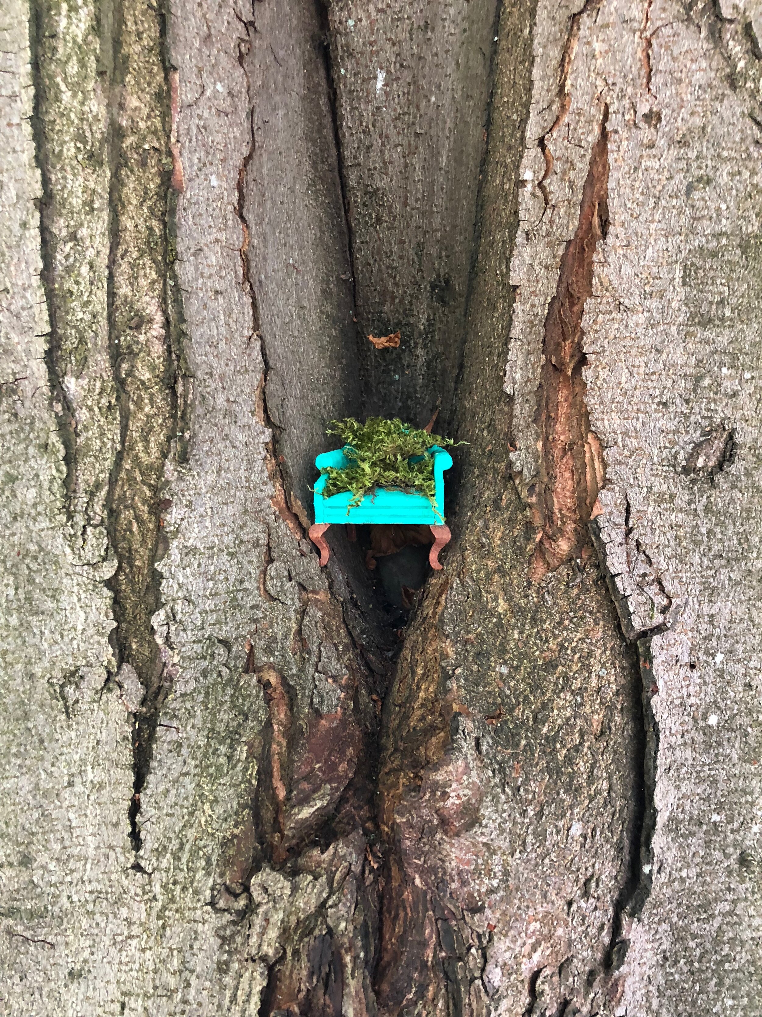
The chair became smaller and smaller, disappearing into wallpaper or miniaturized in the alternative world of dollhouses.

“ A house within a house, the dollhouse not only represents the house’s articulation of the tension between inner and outer spheres, of exteriority and interiority - it also represents the tension between two modes of interiority. Occupying a space within an enclosed space, the dollhouses’s aptest analogy is the locket or the secret recesses of the heart: center within center, within within within. The dollhouse is a materialized secret.”

-Susan Stewart, On Longing Narratives of the Miniature, The Gigantic, The Souvenir, The Collection

Which brings me back to where I started - chairs with personalities that reflect a time or the object’s maker.

Artist, Ellie Richards humorously captures the strange times we are in with her rocking chair that doubles as a game and a workout (you have to physically stand and rock the chair to move a steel ball through the maze’s tracks) all the while commenting on the psychology of feeling stuck in a labyrinth.

Rocking Chair by Ellie Richards (@ellieinthewoods)

So tell me - what kind of chair are you sitting in?

Residency in Transit(ion)

I began my first artist residency at Kulturschapp, a former freight depot in the village of Walferdange, Luxembourg back in mid-February. At the time, I was blissfully unaware that this would later become one of the hardest projects I’ve undertaken.

Idea vs Reality

I’ve worked in unusual places before, but never in a location layered in so many histories.

From old lift machinery built into the floor to metal hooks and former pulley wheels lining the stone and brick, this industrial building wears many cracks, holes and patches, from a life along the railway.

The sudden thundering sounds of a train speeding by takes some getting used to, but after working alone for hours on end, you start to welcome the noise - a reminder of the world still moving outside.

Thinking about trains as a symbol of escape, freedom, progress and adventure; a journey from here to there -it’s a strange time in history to find myself working next to the train tracks.

Arlanda Express, February 2020

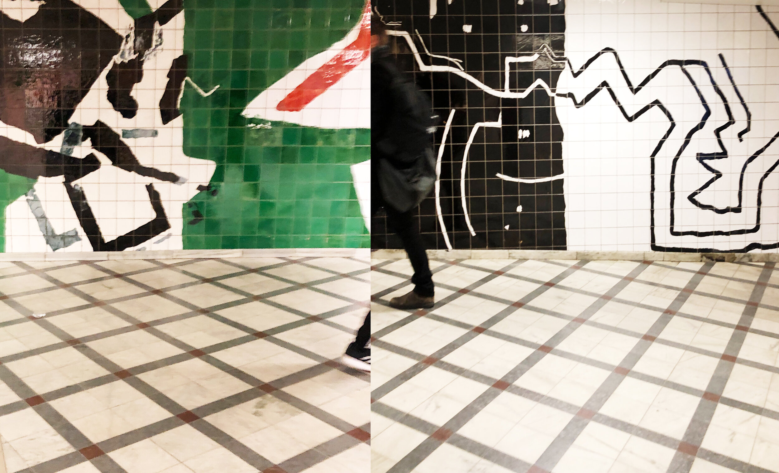
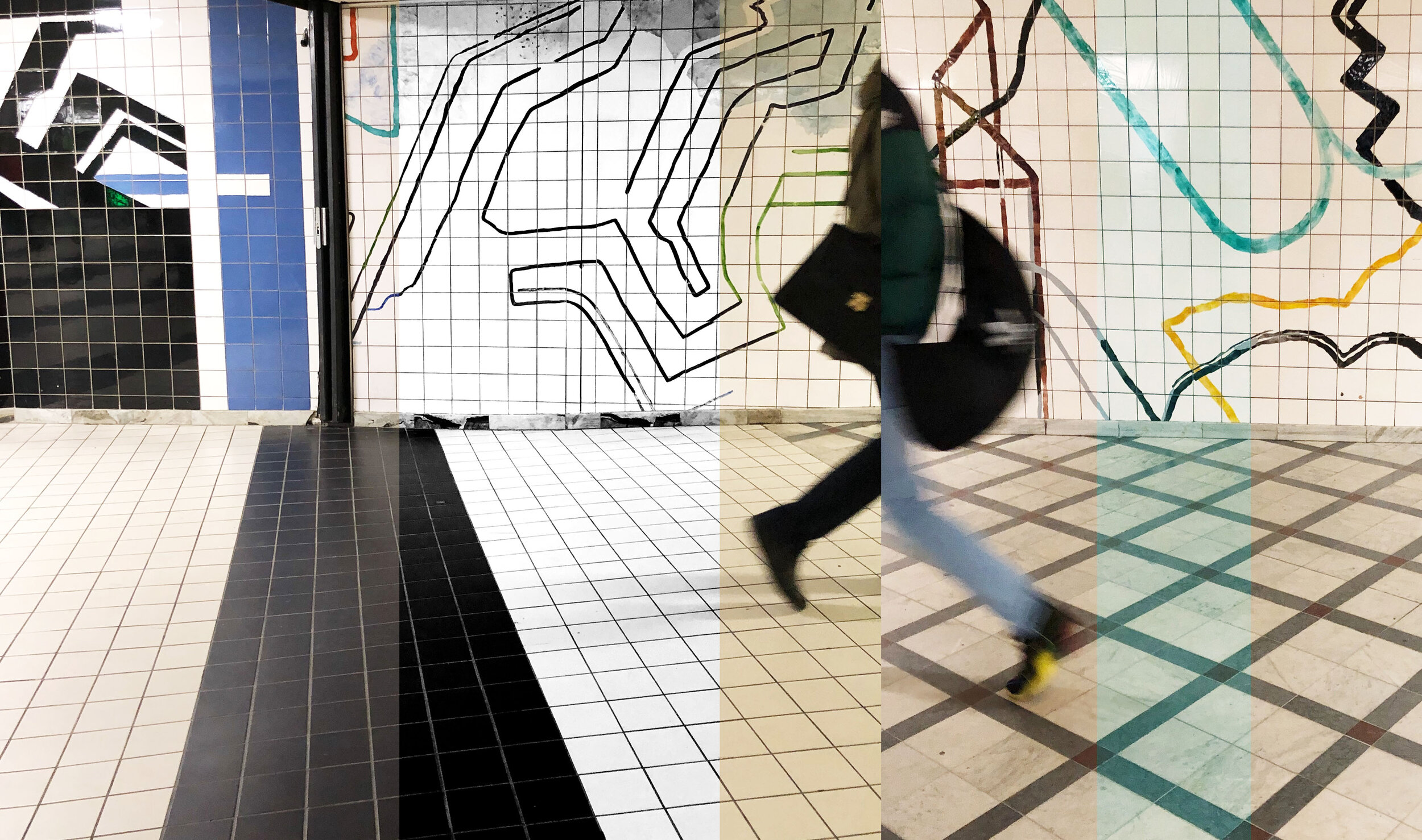
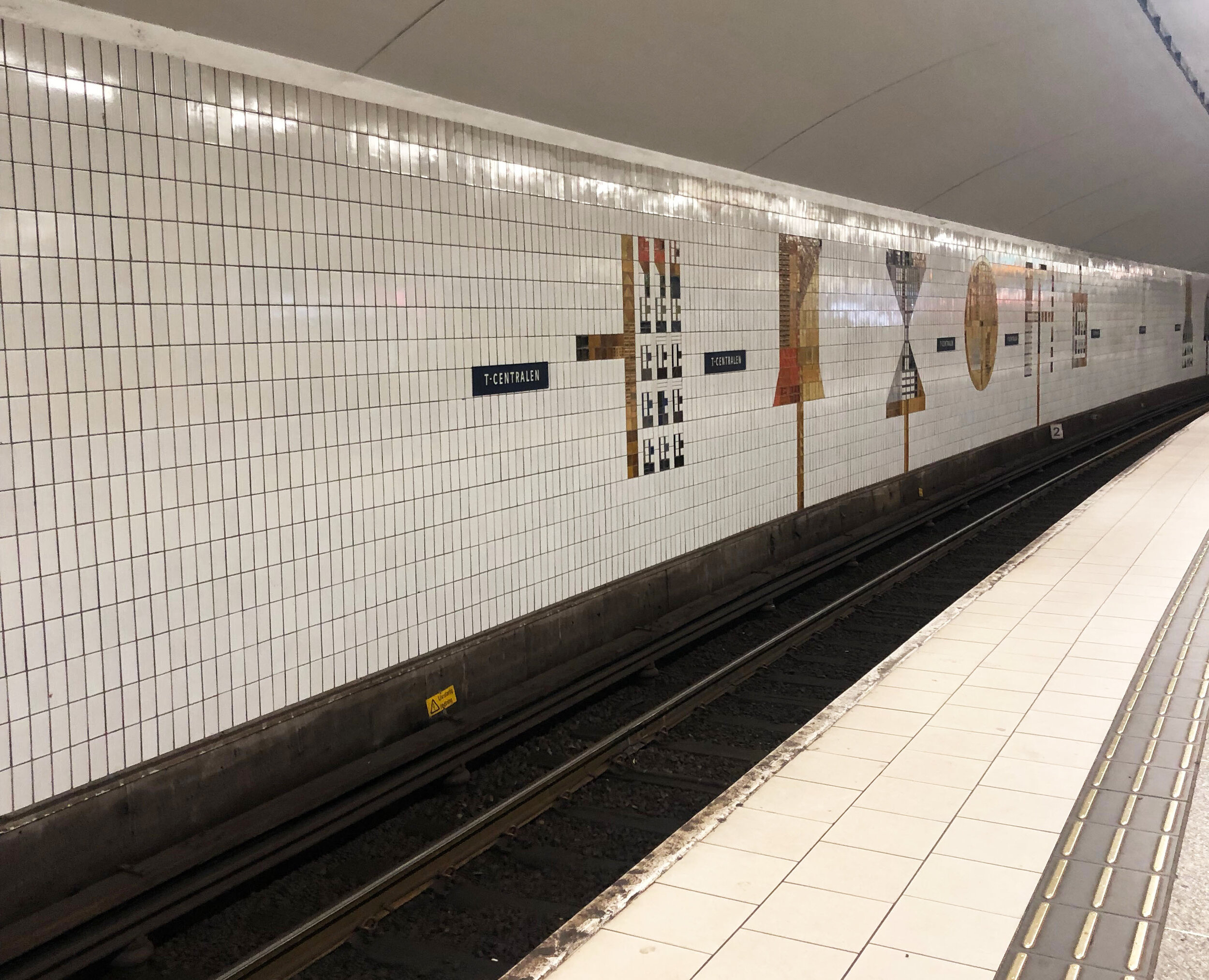
Before the lockdown, I took a brief one day research trip to Stockholm, paying close attention to artwork exhibited in public transit space.

In Sweden the subway system, known as the T-Bana, is often referred to as the world’s longest art gallery with 90 stations designed by artists.

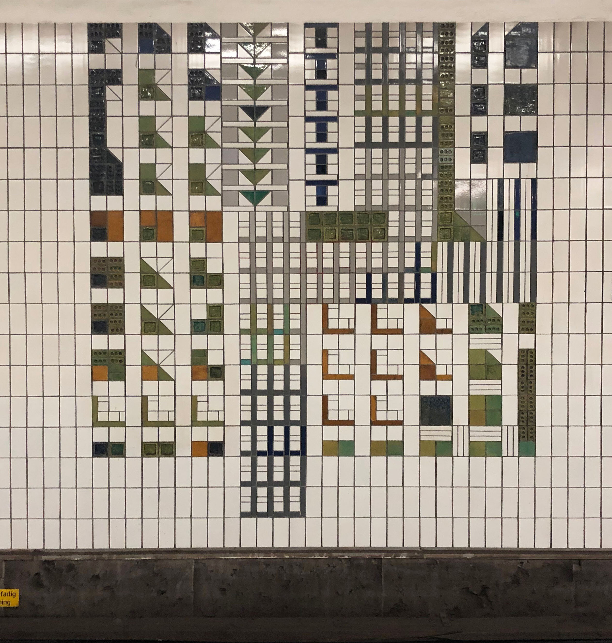
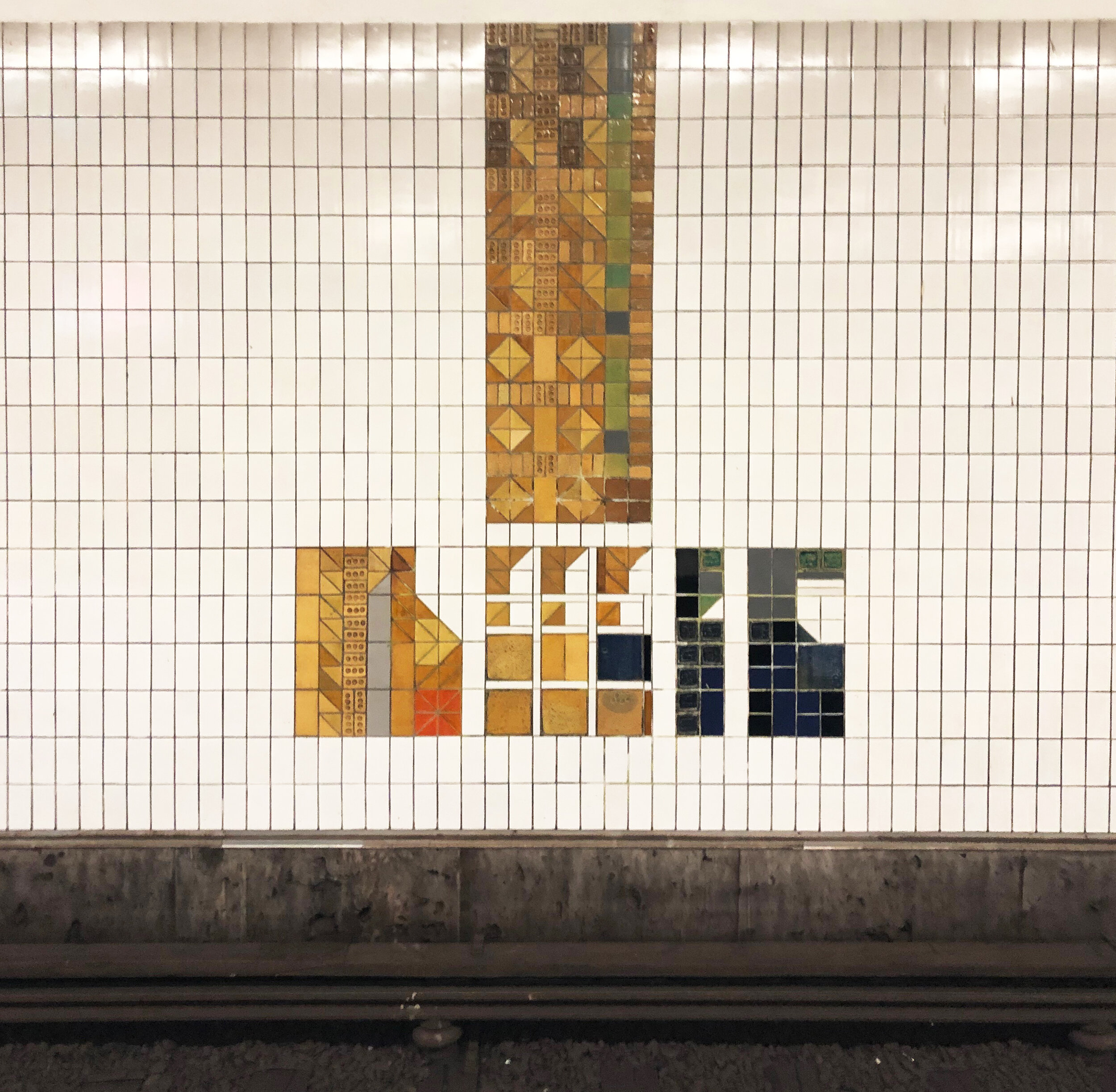
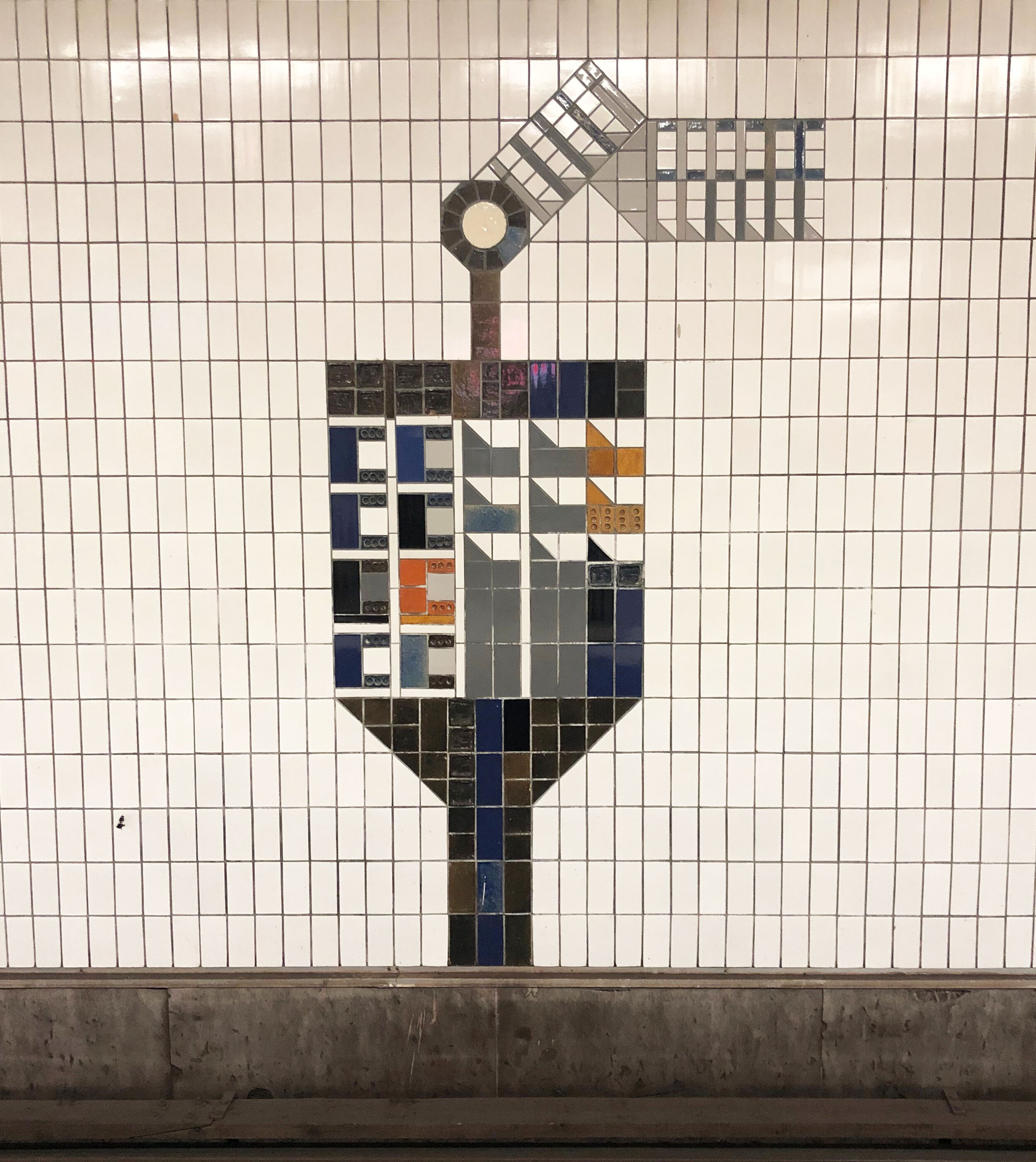
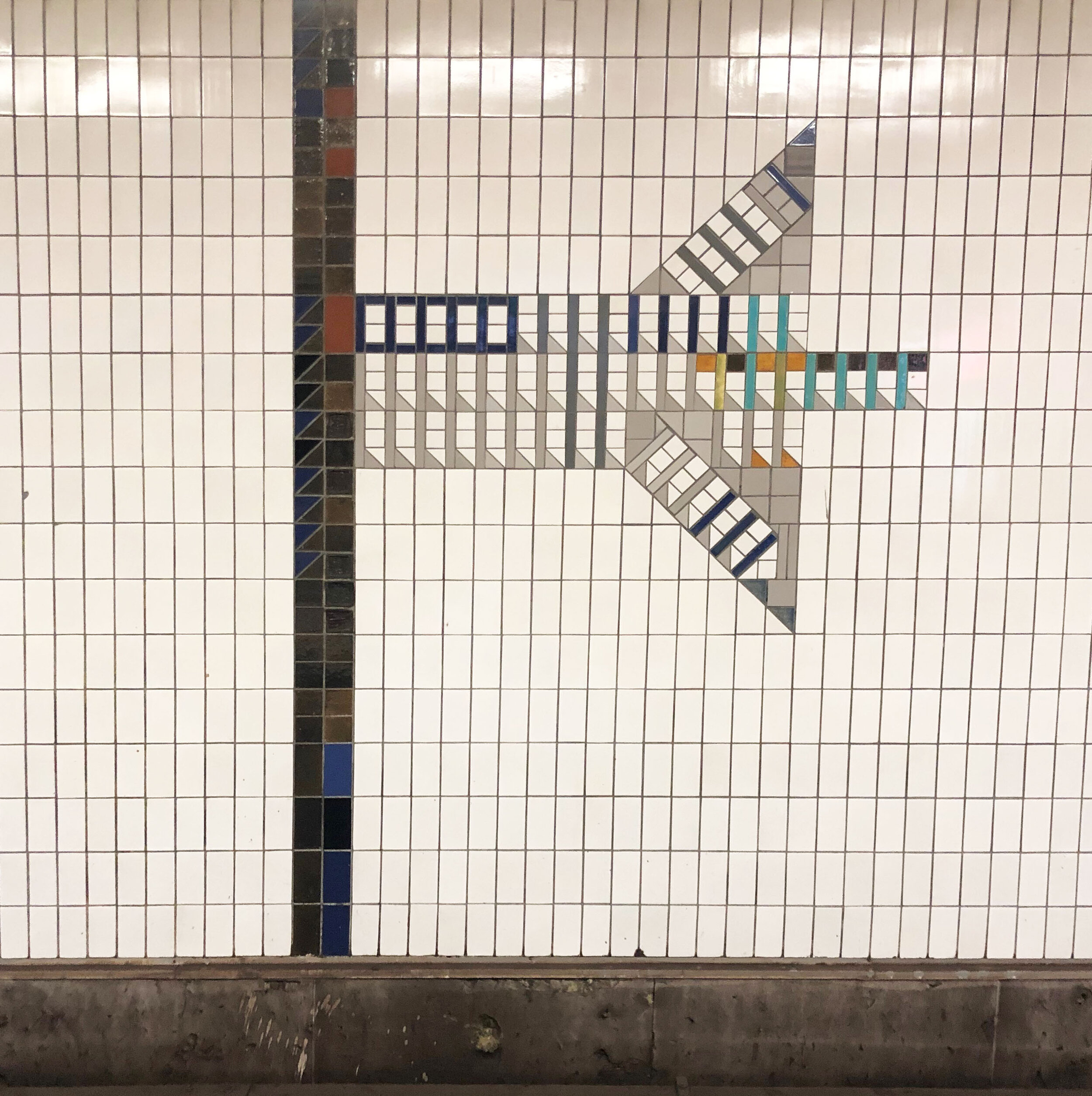
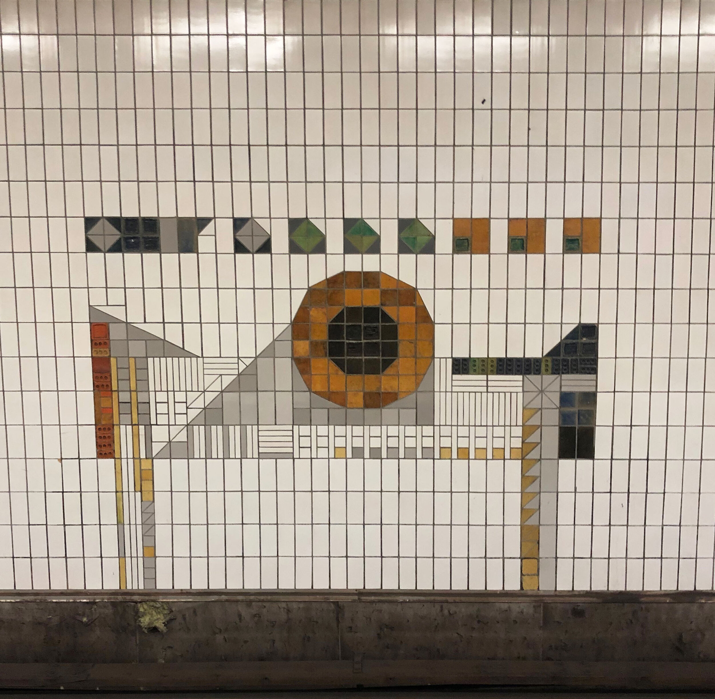
On my commute, I came across new-to-me Swedish artists: Signe Persson-Melin and Anders Österlin. Together in 1957, they created a collaborative series of abstracted traffic signs in geometrically patterned tiles for the T-Centralen Station.

I kept thinking about abstracted shapes, where they come from and how we interact with them; the windows we look through to the arches we walk under.

Play and assemblage of shapes and forms became a central theme during my residency at Kulturschapp, culminating in a final installation titled, “Excavated Reveries.”

Unfortunately due to the coronavirus, the exhibition is postponed, but I am adapting to our new reality by featuring this series of collages and sculptures as a virtual vernissage.

Installation View (Grid Side / Pink Side), Kulturschapp, April 2020

Detail (Left) “Unpredicable Loops" (Right) “Shelves too Small to Hold Anything Useful,” Kulturschapp, April 2020

With many pieces throughout the installation created from recycled materials, such as salvaged metal, domestic ephemera and collected paper advertisements, there is an underlying curiosity about the relationship of people to their surroundings.

The symbolism in the places people carry with them are embodied in souvenirs and each composition is a collection of objects as memory markers.

(Left) “Positive Interruptions Are Like Gaps In the Clouds” (Center) “The Mountain in your Mind’s Eye(Right) “In The Blue Hour” Kulturschapp, April 2020

“Stuck Underneath The Weight of My Days” Kulturschapp, April 2020

“Stuck Underneath The Weight of My Days” Kulturschapp, April 2020

Throughout the residency, ideas shifted as access to materials became limited. I scavenged and substituted empty toilet paper rolls and cardboard for less accessible wood; surprising myself with the materials I had on hand and experimenting with paper maché and plaster.

I was reminded that the very act of making is a form of resiliency. From the beginning, I pushed myself to use this time and space as an opportunity to work differently, roll out 10 meters of paper, suspended as curtains or test new ways to translate flat drawings and prints as sculptural forms.

I also started new experiments, keeping a little notebook where I recorded a stream of consciousness list every day (with some entries a day late) and a walking journal. Partly inspired by the literary style of Jenny Slate in her book, “Little Weirds,” and to pay closer attention to little big things.

This daily practice was my own way of training myself to attempt a consistent routine and record my train of thoughts. I reveled in the slower moments embodied in the color, shape, or texture of nature’s visual elements.

I found myself attracted to the budding yellow and pink blooms, chasing the golden light and smiling in the sunshine; looking up to clear blue skies and feeling a soft sadness about the color blue, wanting to hold onto what was never within my grasp.

As fortunate as I was to have an artist residency like Kulturschapp as a refuge to escape to during this strange time, it was difficult to stay focused and have the headspace for creating. I had to regularly remind myself to be kind and adjust my expectations as everyday tasks felt harder to complete.

(Day 35 of quarantine) Words of encouragement from my former painting professor, Maja Goldewska. I still remember being asked if a group of us wanted to exhibit in a one day show, she said “It is crazy, but you can do it.” I’m still doing it.

Big thanks to Joël Rollinger, Artist & President of Kulturschapp, for this opportunity and to Spencer Gaddy for being my forever artist assistant.

The Distant Daily

I’ve been close friends with Meagan Long, founder of Goteya, for the past thirteen years. In that time we have lived far and further apart.

Due to the Covid-19 pandemic that is turning the world upside down, both of us find ourselves in our respective corners of the world - from Brooklyn, NY to my small village in Luxembourg, simultaneously sheltering in place and social distancing to help prevent the spread of infection.

Day 1: Reading on the fire escape in the sun: a postcard never sent / New blooms shaped like violet tears at 5:30 pm

In an effort to chronicle our similar, yet different lives in lockdown, we’ve started a collaborative project called The Distant Daily. It is both a gesture between friends to remind each other that we are alone together as well a way to let imagery communicate the words we are still trying to form.

Day 2: A deserted highway with one shop open / The relief of an unexpected sign to stop you from crying

The Distant Daily takes the simple act of sharing one photo a day and exposes a complicated composite of emotions and poetic metaphors unveiled in our pairings. Signs formed in hay vs those still flashing in neon shift to symbols in shadows or blooms of hope shaped like tears.

Day 3: A once thriving industrial park in Bush Terminal, Brooklyn / New Rituals

Taking photos is how we are learning to cope and connect while adjusting to these new surreal realities.

Day 4: Industrial seascape / A hoop without a net, but a shadow for a friend

While we are all trying to weather our new storms, here is a non exhaustive list of additional creative responses & resources for you during this crisis:

What is helping you?

Mapping Messes

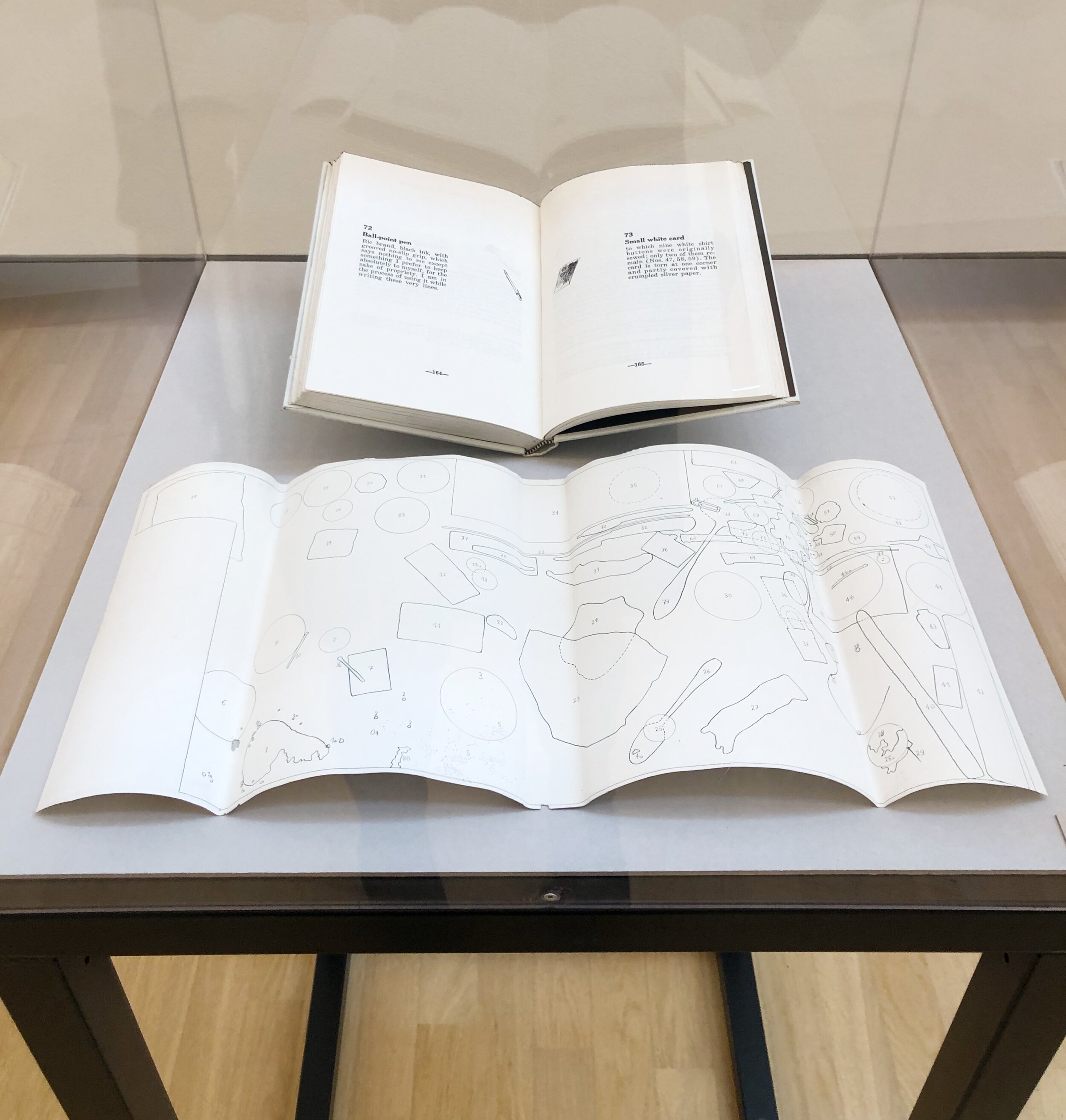
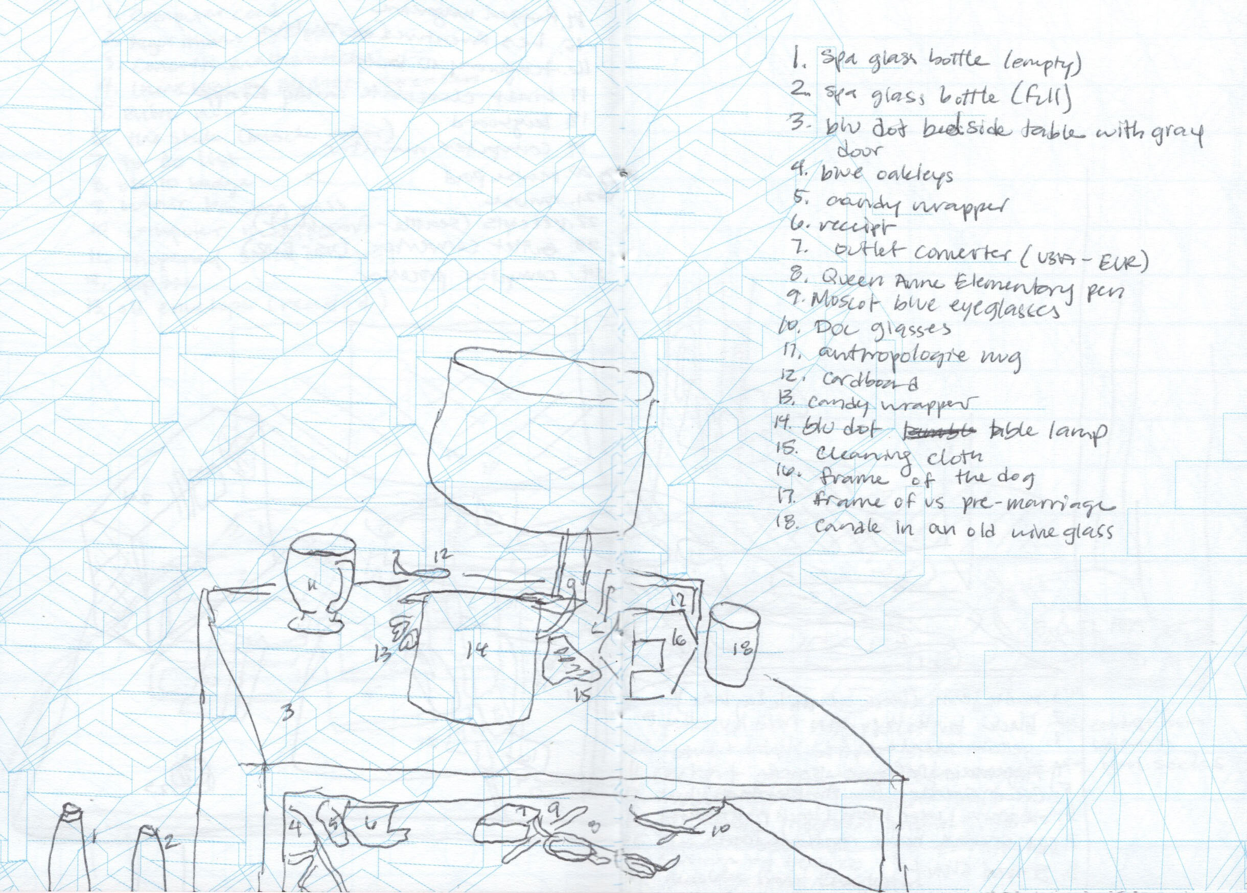
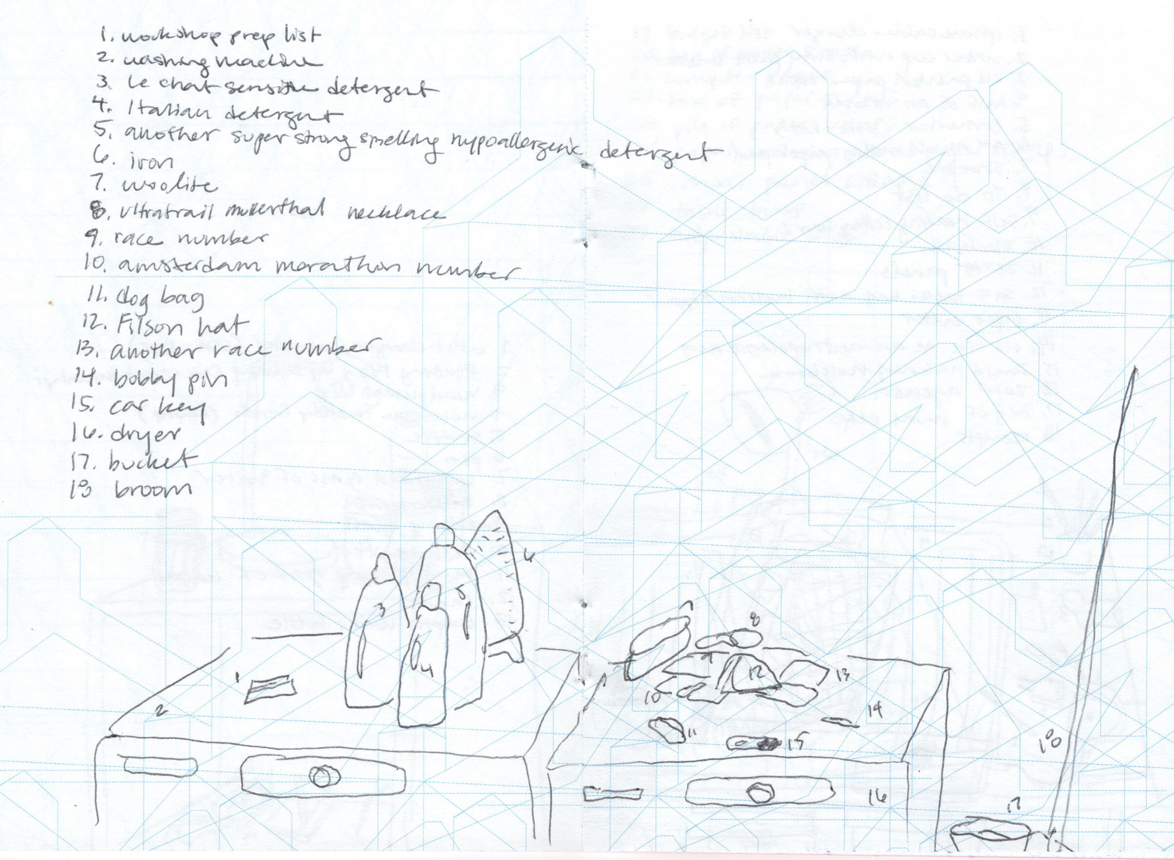
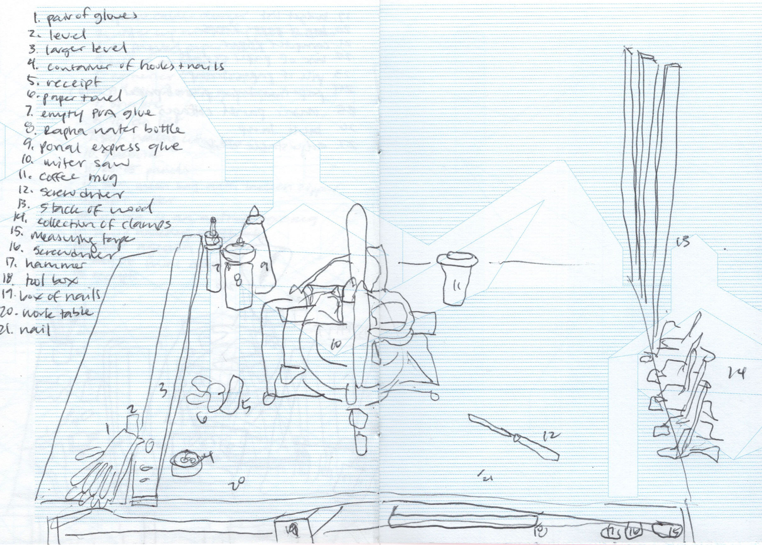
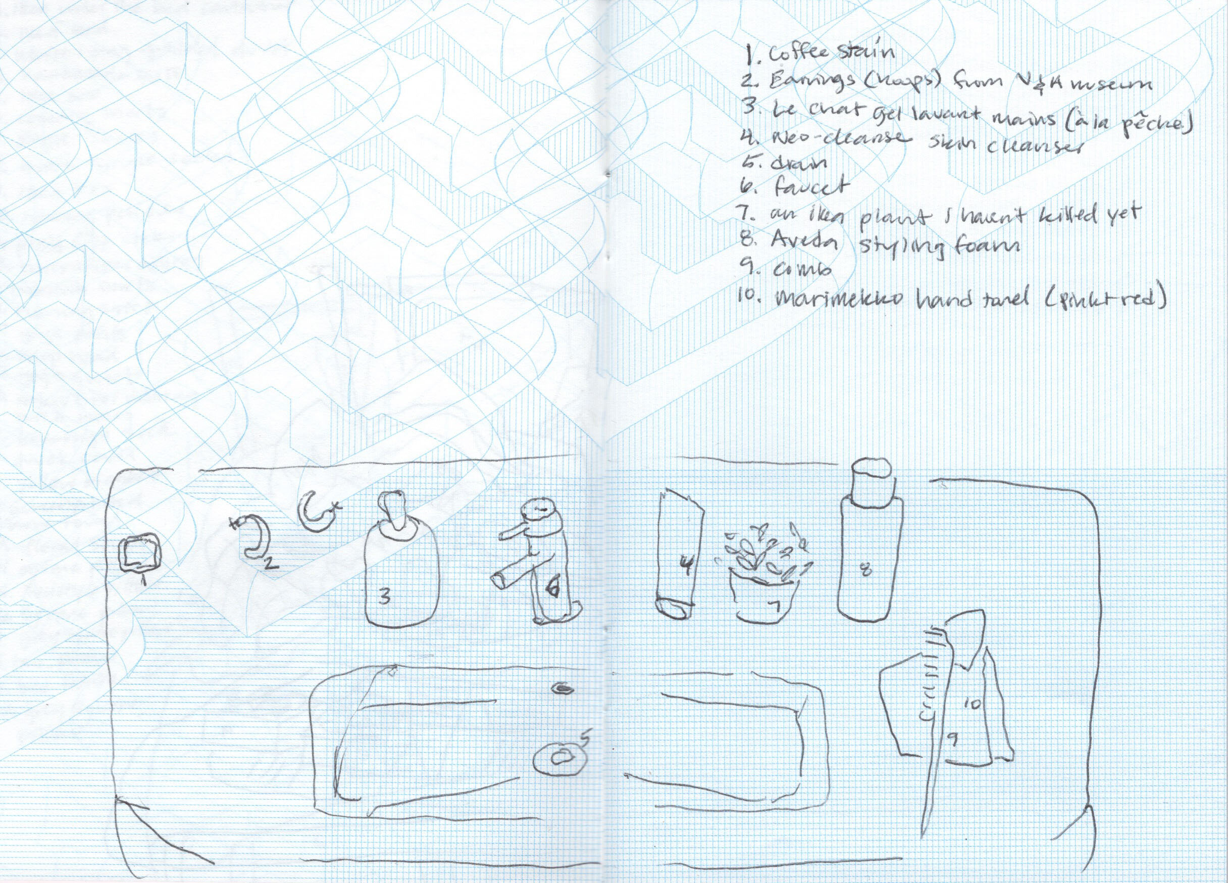
Daniel Spoerri is a Swiss artist and writer born in Romania in 1930. He is most well known for his “snare-pictures” and corresponding book, “The Anecdoted Topography of Chance.”

anecdoted.jpg

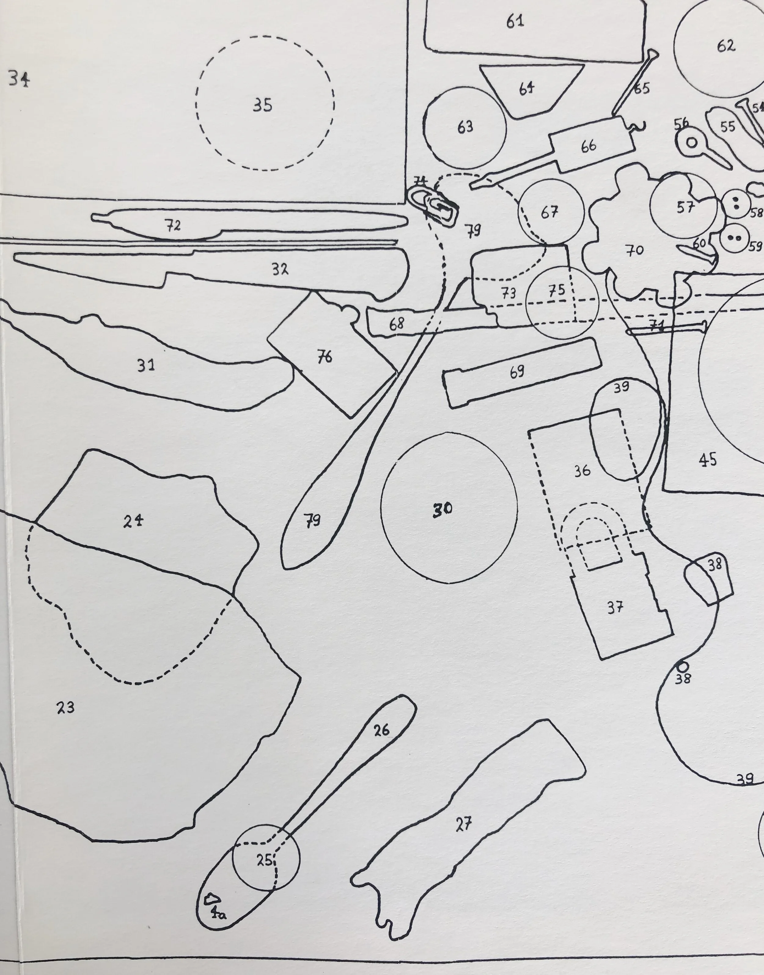
I interpret Spoerri’s snare-pictures as a game of creating maps that simultaneously avoid cleaning. However, his definition is a depiction of objects found in chance positions at a particular time and in a particular location, fixed in place either through assemblage or drawn diagrams.

An Anecdoted Topography of Chance, Page 241: FOLDOUT, Daniel Spoerri, Cubist View of My Room, No 13, Hotel Carcassonne, at 24 rue Mouffetard, Paris 5éme, taken according to my instructions by Vera Mertz Spoerri in 55 individual photographs and mount…

An Anecdoted Topography of Chance, Page 241: FOLDOUT, Daniel Spoerri, Cubist View of My Room, No 13, Hotel Carcassonne, at 24 rue Mouffetard, Paris 5éme, taken according to my instructions by Vera Mertz Spoerri in 55 individual photographs and mounted on plywood, 189 by 88 cm, 1961

“In my room, No. 13 on the fifth floor of the Hotel Carcassonne at 24 Rue Mouffetard, to the right of the entrance door, between the stove and the sink stands a table…I have set out to see what the objects on a section of table might suggest to me, what they might spontenously awaken in me in describing them: the way SHERLOCK HOLMES, starting out with a single object, could solve a crime or historians, after centuries, were able to reconstitute a whole epoch from the famous fixation in history, Pompeii.”

-Daniel Spoerri, 1962 from An Anecdoted Topography of Chance, p. 23

“…his original idea, to trap reality in a snare. To pin it, stuffed to the wall of blank page…He was concerned above all with exhausting the potential descriptions of a Parisian scene at a particular moment in time.” - Roland Topor

An Anecdoted Typography of Chance, page 148-149 (Object 46: Greenish Bakelite ashtray - Object 46a: Burnt match in ashtray

In my version, the updated 1966 publication of Spoerri’s “An Anecdoted Typography of Chance,” co-written by Spoerri and his friends - the book is classified as an “artist book, a novel of digressions, a rambling conversation, a game, an encyclopedia, a cabinet of wonders and even a celebration of friendship and creativity.”

The book meticulously notes every object depicted in the Topographical Map of Chance, 17 October 1961, snare-picture and records each object’s evoked associations, memories and anecdotes.

An Anecdoted Typography of Chance, page 149: 46a: Burnt Match

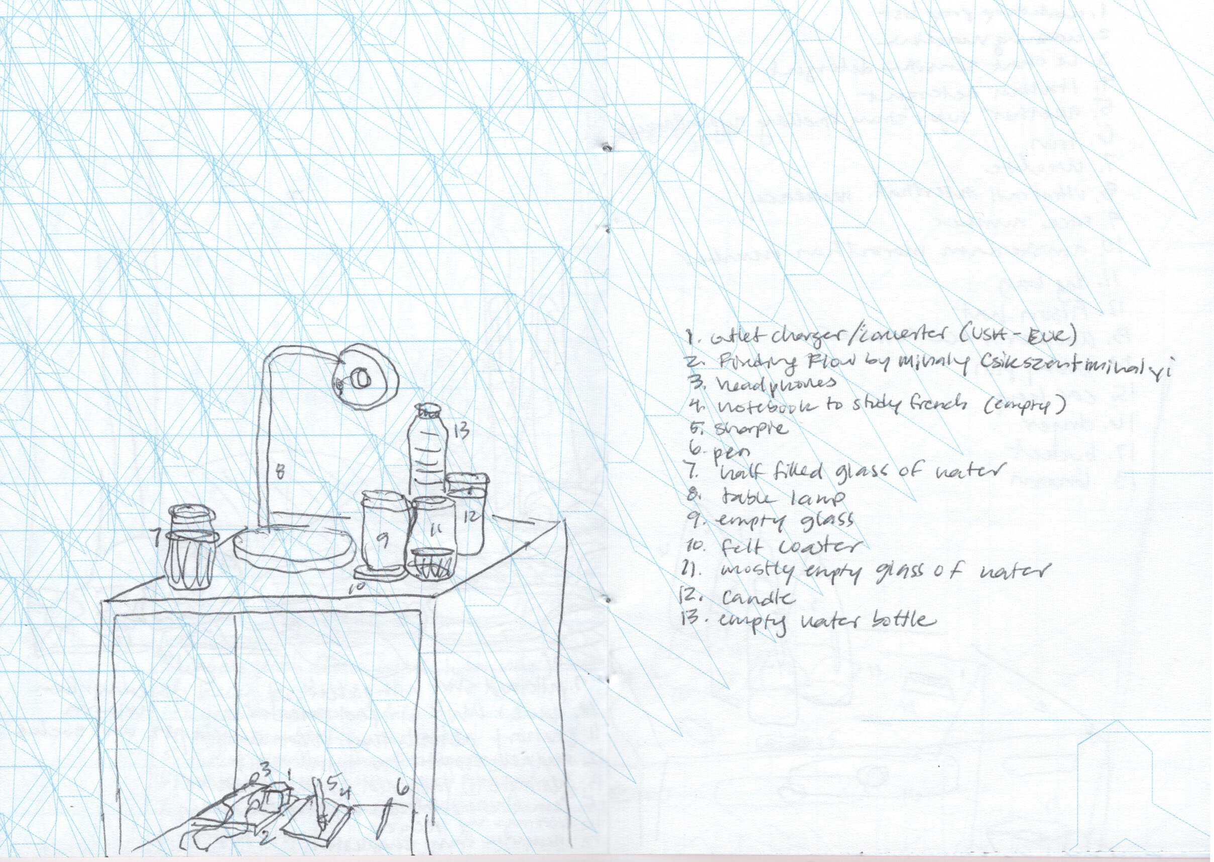
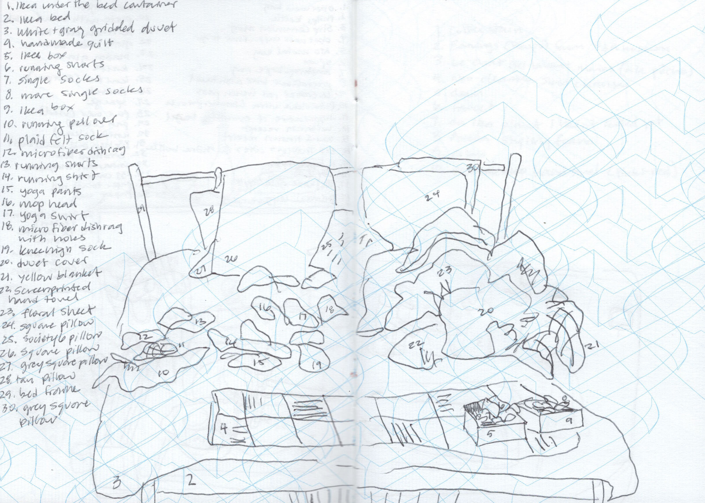
Partly influenced by the multi-faceted recordings of “symbols as old discarded stuff,” and my own reflections on the current state of my house, I began outlining my collection of domestic battles with never ending mess.

A Collection of Little & Rather Big Messes (Did they clean themselves, we’ll never know) in a mini pink &Luxembourg notebook, designed by Isabelle Mattern

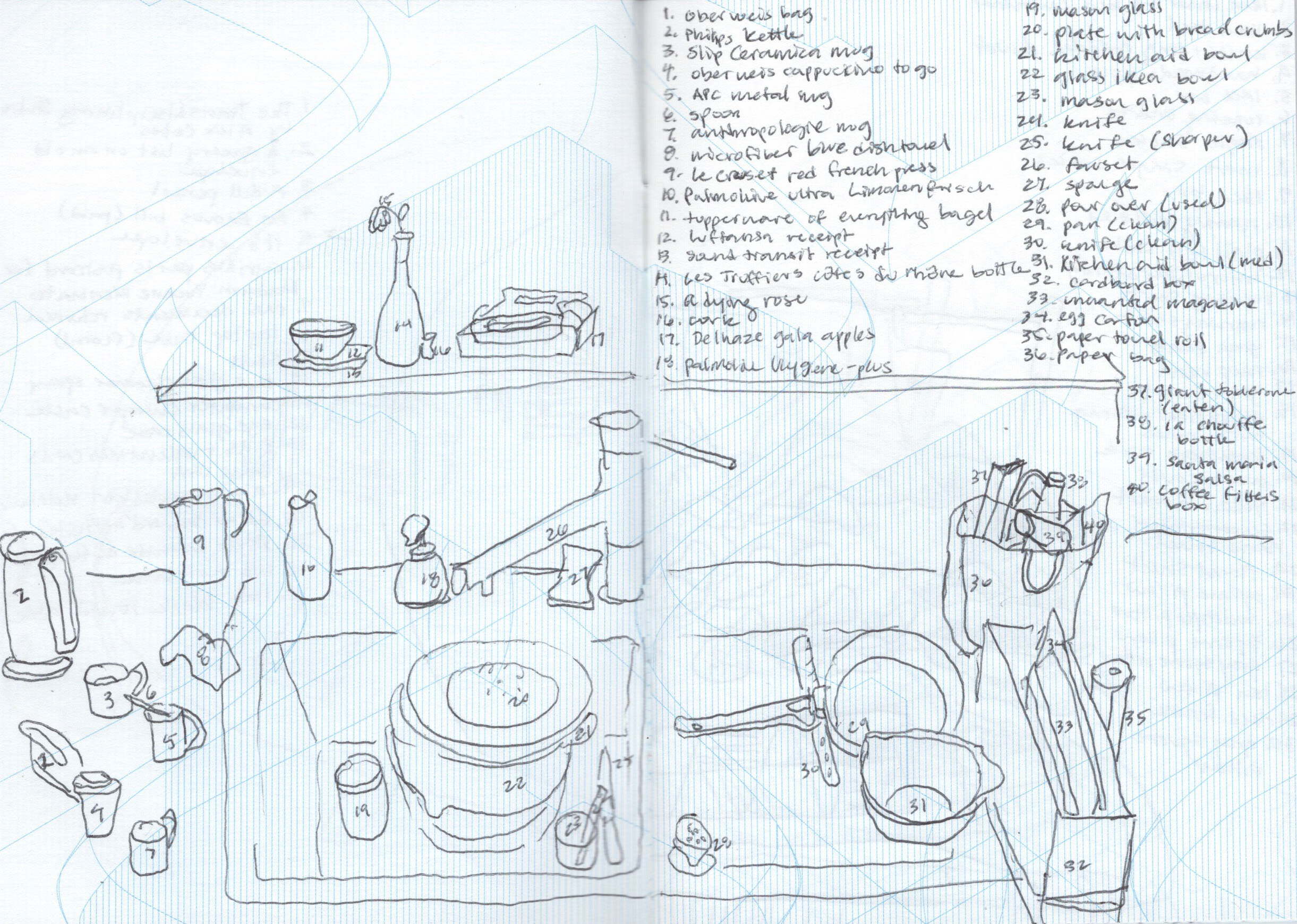
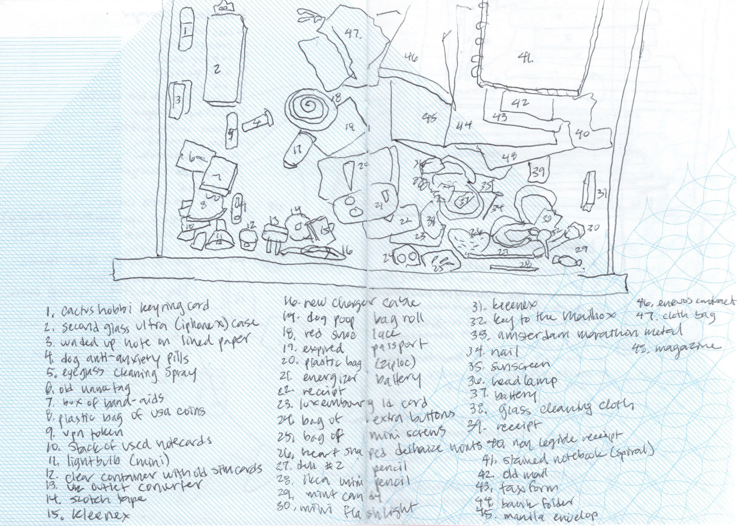
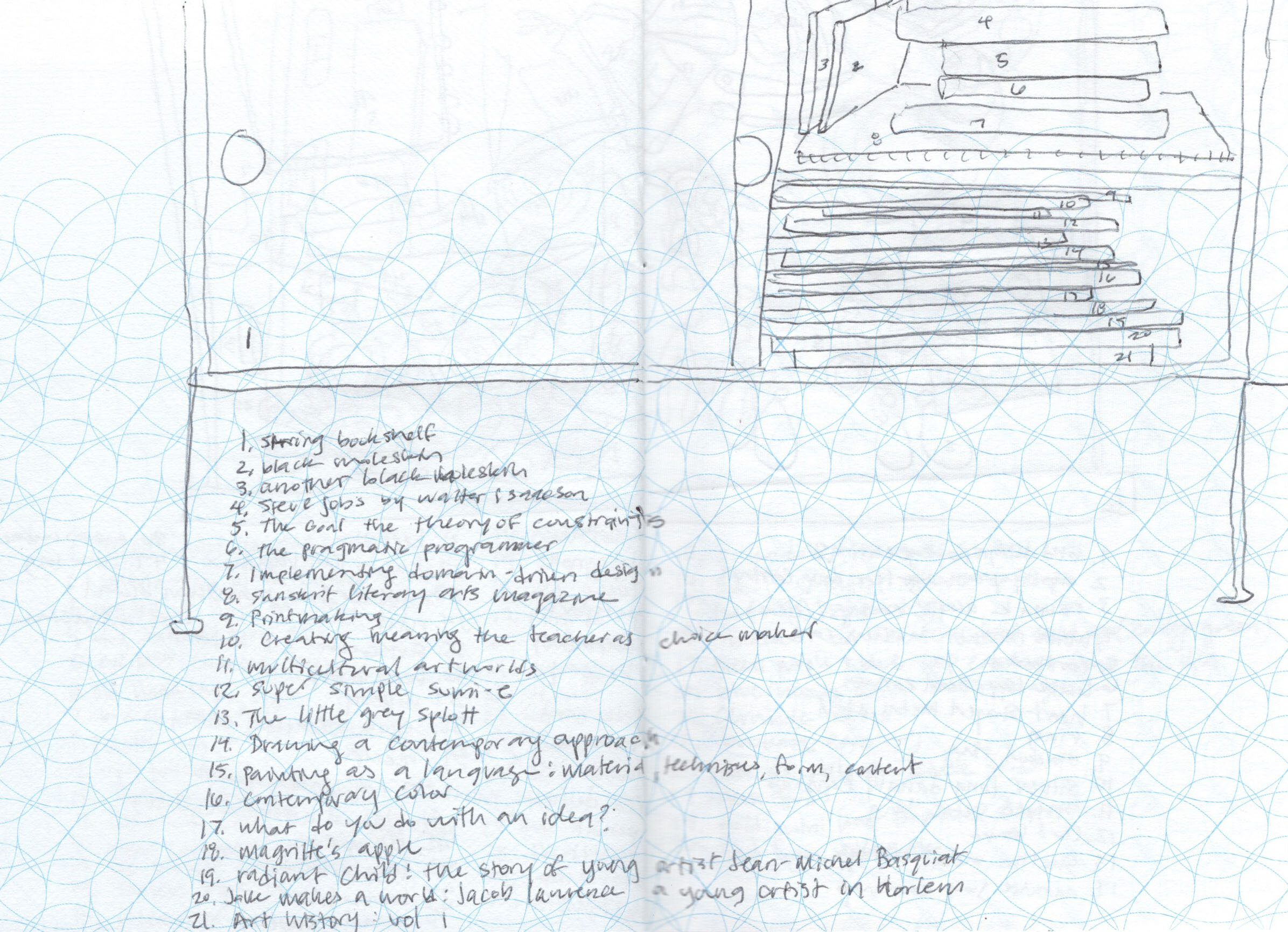
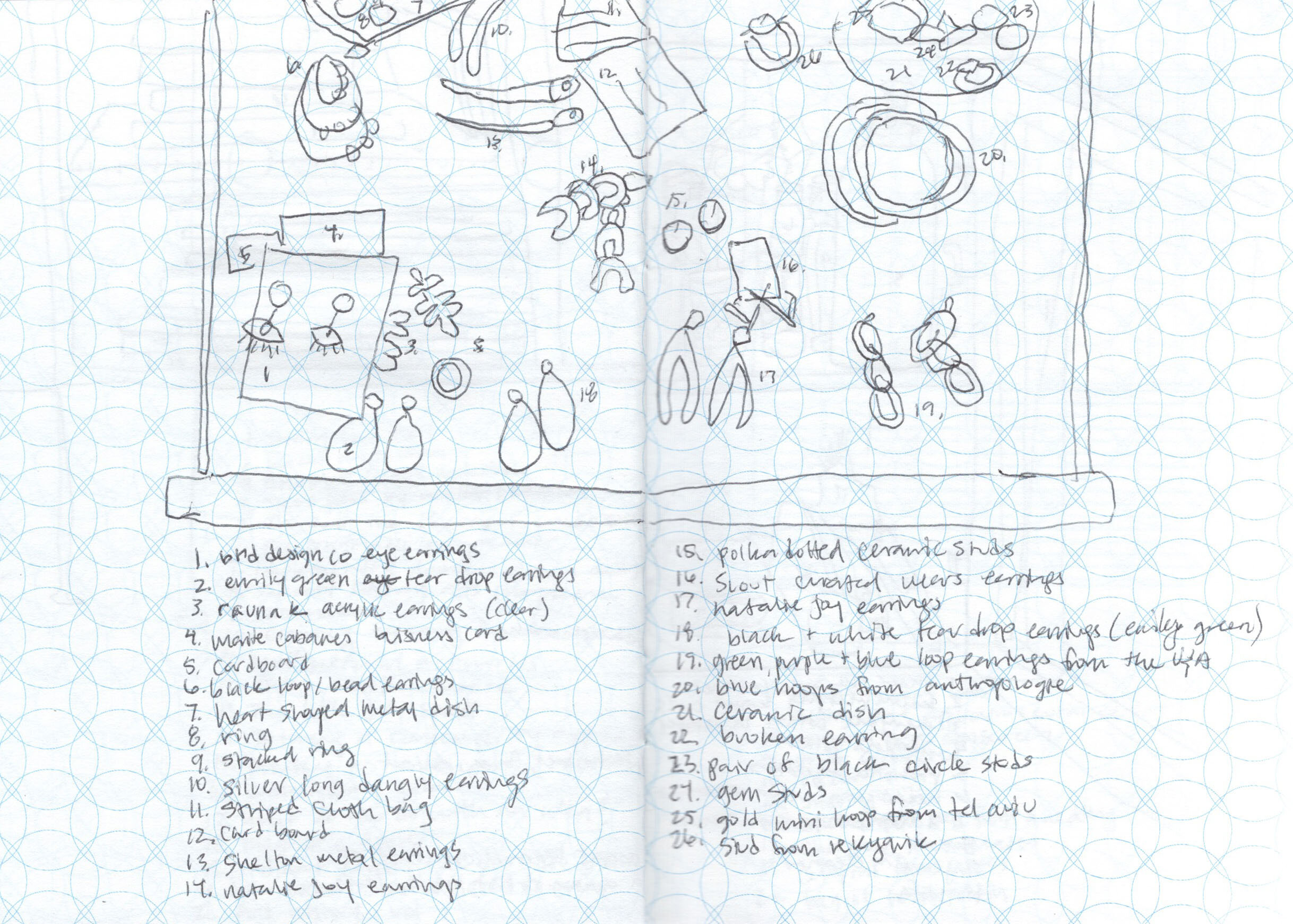
Fed up with my cyclical chores, I went from room to room, surface to surface, documenting the various: piles, stacks, mountains, lumps, bumps, towers, and labyrinths of mazes in and around my home.

37 Objects on the Dining Room Table, 2020

When I think about how objects I choose to live with paint a type of portrait with the meaning and symbolism I’ve projected on them, I start to see a different kind of narrative within the chaos of my mess.

On my studio table, I see evidence of the creative process, forgotten cold tea included.

My messes reflect the relationship of my things to my environment, like my pile of clothes burying my window sill, with folds, mimicking the very shapes and forms within the landscape seen from the window behind it.

19 objects on my window sill

19 objects on my window sill

In the same vein, overlapping messes of a shared meal, the leftover dirty dishes reveal a type of exchange akin to a conversation, like the the way two different people inhabit and utilize objects in shared spaces, but in this case, the privacy of the home.

Beginning of the week vs end of the week.

In MacGuffin Magazine, Issue No. 5, critic, Sam Jacob contributes an essay, Life Among Things.

“Jump cut to the very room you are in and look at all the stuff around you. Can you explain all this stuff? What it’s doing there? Why you have it? Why you keep it? How could we begin to describe our life with objects?

-Sam Jacob, “Life Among Things,” an essay to accompany the exhibition, “Finders Keepers” at the Het Nieuwe Instituut in Rotterdam

In fiction, a MacGuffin (sometimes McGuffin) is an object, device, or event that is necessary to the plot and the motivation of the characters, but insignificant, unimportant, or irrelevant in itself. (From Wikipedia)

In fiction, a MacGuffin (sometimes McGuffin) is an object, device, or event that is necessary to the plot and the motivation of the characters, but insignificant, unimportant, or irrelevant in itself. (From Wikipedia)

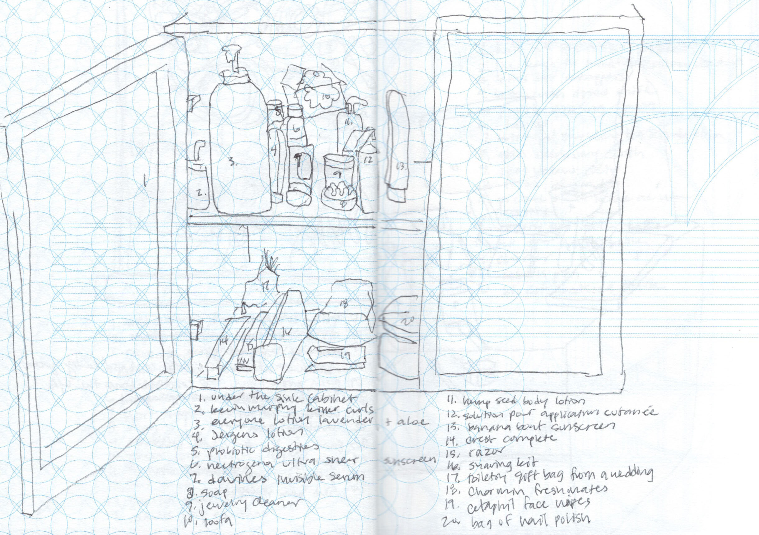
What most snare-pictures don’t reveal, are the hidden objects, tucked away in cabinets and drawers. Think of all the junk drawers, the stuff we don’t want to clutter our counters, the many secrets we hide from ourselves and others.

Even Walter Benjamin, who famously wrote the classic essay, “The Work of Art in the Age of Its Technological Reproducibility,” (1935-1936), writes of cabinets as mirrors of our culture, both ‘veil’ and ‘what is veiled’, in his autobiography, “Berlin Childhood Around 1900.”

Kirsten Algera and Ernst van der Hoeven, editors of MacGuffin Magazine, describe “Benjamin’s cabinet odyssey” as exhibiting the same characteristics of what make cabinets interesting: to show, hide, and keep things.

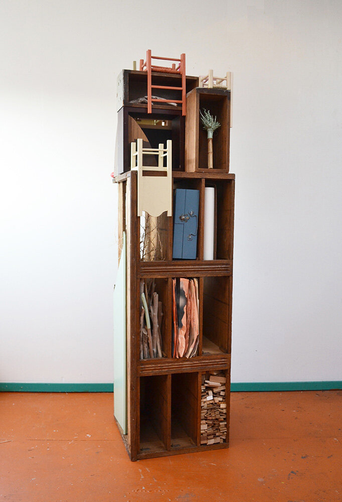
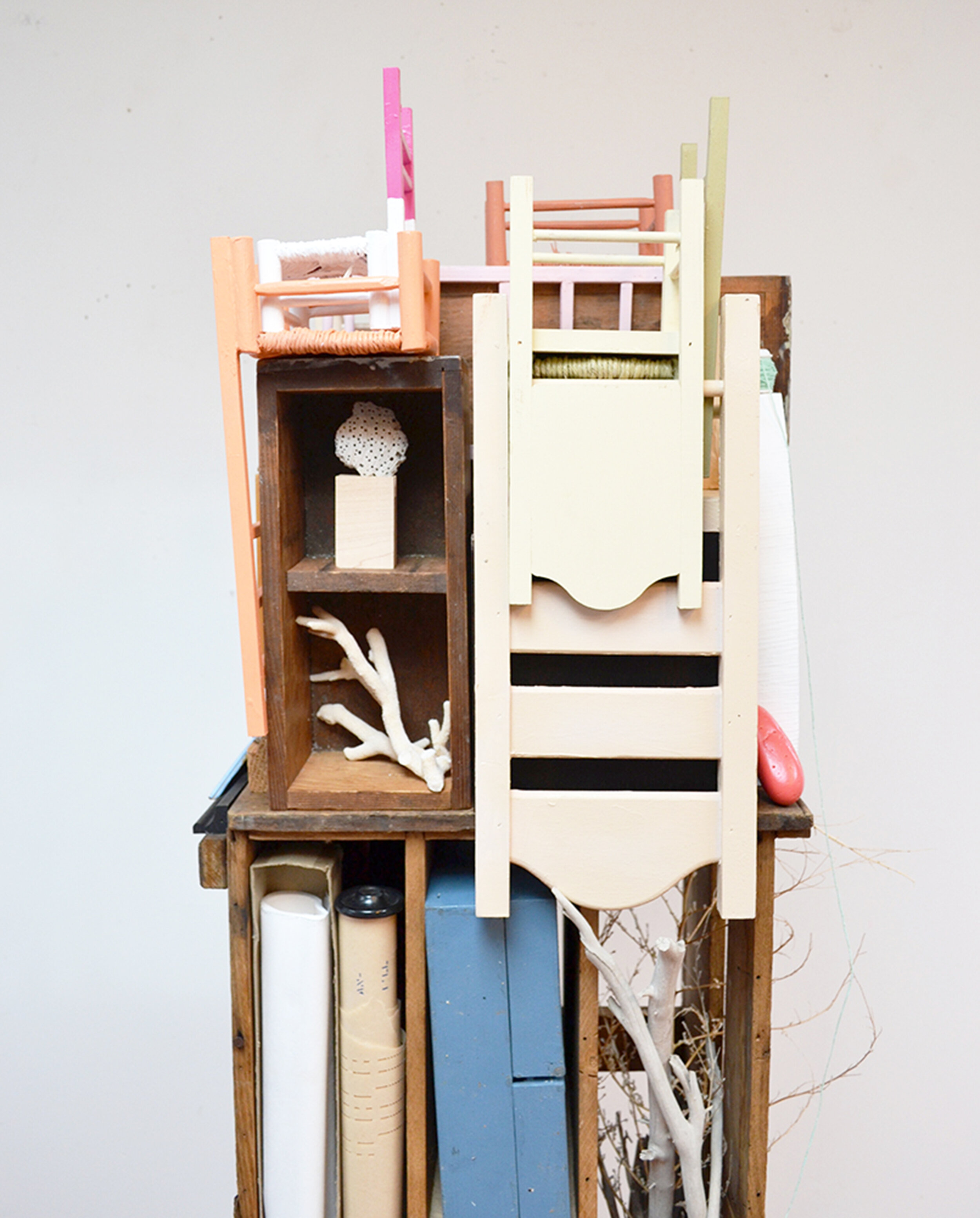
Saving Seats & Storing Secrets, was a stacked sculpture created from a former rejected cabinet. Never exhibited publicly, it was built to demonstrate objects as carriers of memory, serving as boundary markers for the symbolic configurations known as home - a former snare-picture of sorts.


What do you show, hide & keep?

The Way I've Learned to Travel

I’ve always been encouraged to explore. In my family, if you have an opportunity to travel, you take it, regardless of the consequences.

Made it to Paris despite a nationwide strike

This year I have traveled to eleven countries.  After making every mistake, including turmeric spice exploding in my luggage, I have now perfected the art of packing a bag.

Whether it is a solo journey, a really long drive with a gassy pup, or hopping from train to bus, helping my mom with her oversized luggage - some things I have learned that have helped me get better at traveling are:

list 1 copy.jpg

Pack only the essentials.

I try to take only the things I know I will need. For me packing gum, water, a snack (usually something salty), and dizziness medication can make or break a trip.

My motion sickness survival kit, (most of the time I carry a reusable water bottle, but this plastic bottle was more interesting to draw)

My personal never-leave-home-without item is my moleskin sketchbook, accompanied by one or two pens, and an extra tote (just in case). And if I can, I will add a book and my polaroid camera.

What you will always find in my bag, but the books get switched out periodically

Research in advance as much as you can, but don’t be too hard on yourself when you get it wrong. The truth is you can always buy a new sweater when you are freezing or new shoes when you have to walk 10+ miles (16 km) because the metro is closed due to a strike.

Just don’t forget to laugh when your friend convinces you to go with her to a club in Düsseldorf and all you have to wear is a turtle neck and an overall jumper.

list 2 copy.jpg

Decide what your priorities are.

My priorities range depending on the type of travel. If I am in London on a research trip, I plan out in advance which exhibitions I want to see the most and where the museums and galleries are located in proximity to one another.

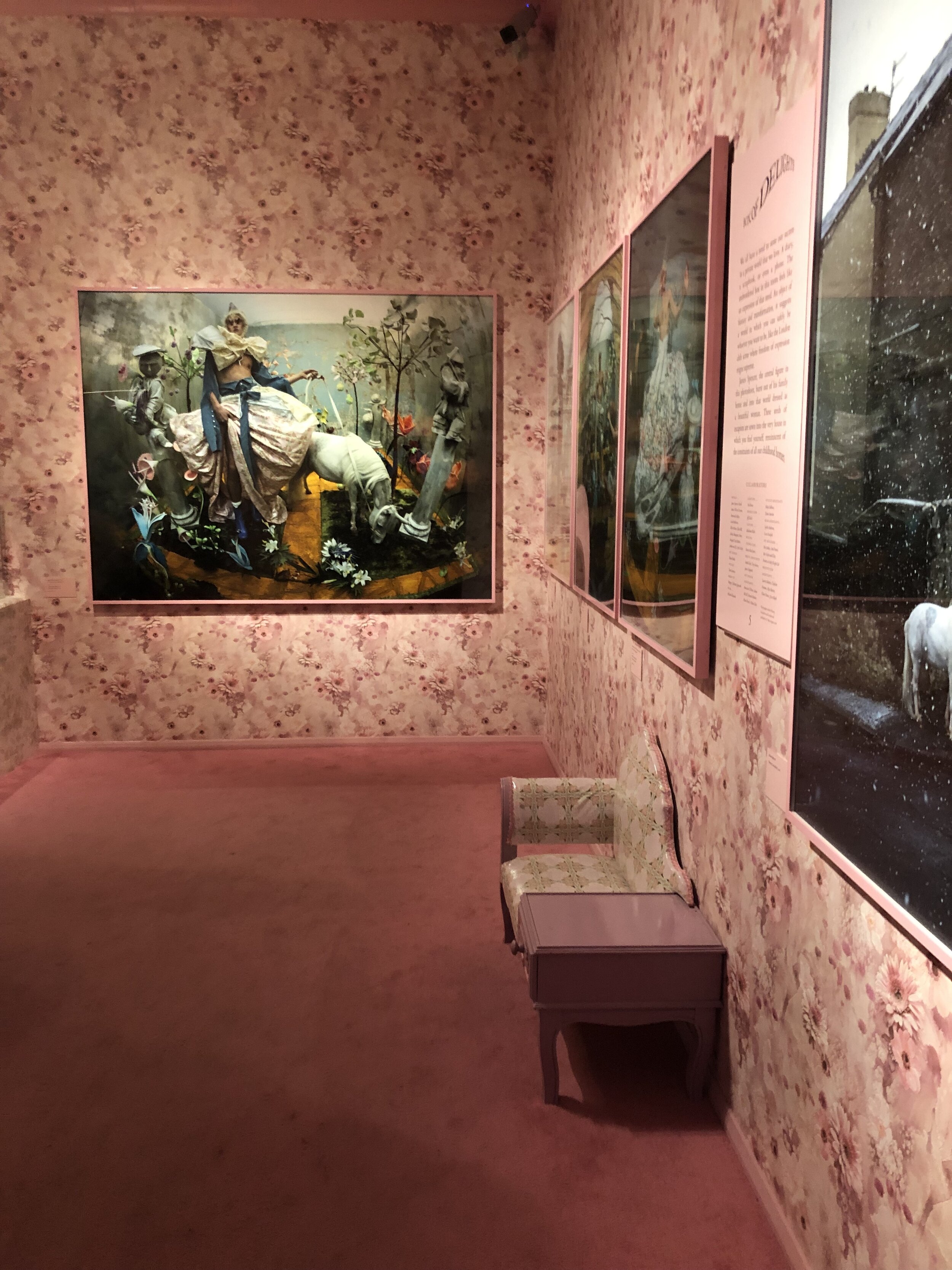
I like to visit museums like the Victoria & Albert, not only for their mesmerizing exhibitions like, Tim Walker: Wonderful Things, but also for practicality.

Museums are my solution to when it is cold and wet outside or if you have a few extra hours before you can check in to wherever it is you are staying. The bonus is that if your bag is small enough, you can shed it and your extra layers at coat check for a small fee of 1£.

It is good to come to terms with the fact that you will not and can not see everything before you arrive. Places like London have endless galleries and museums. I had to decide what was most important for my research.

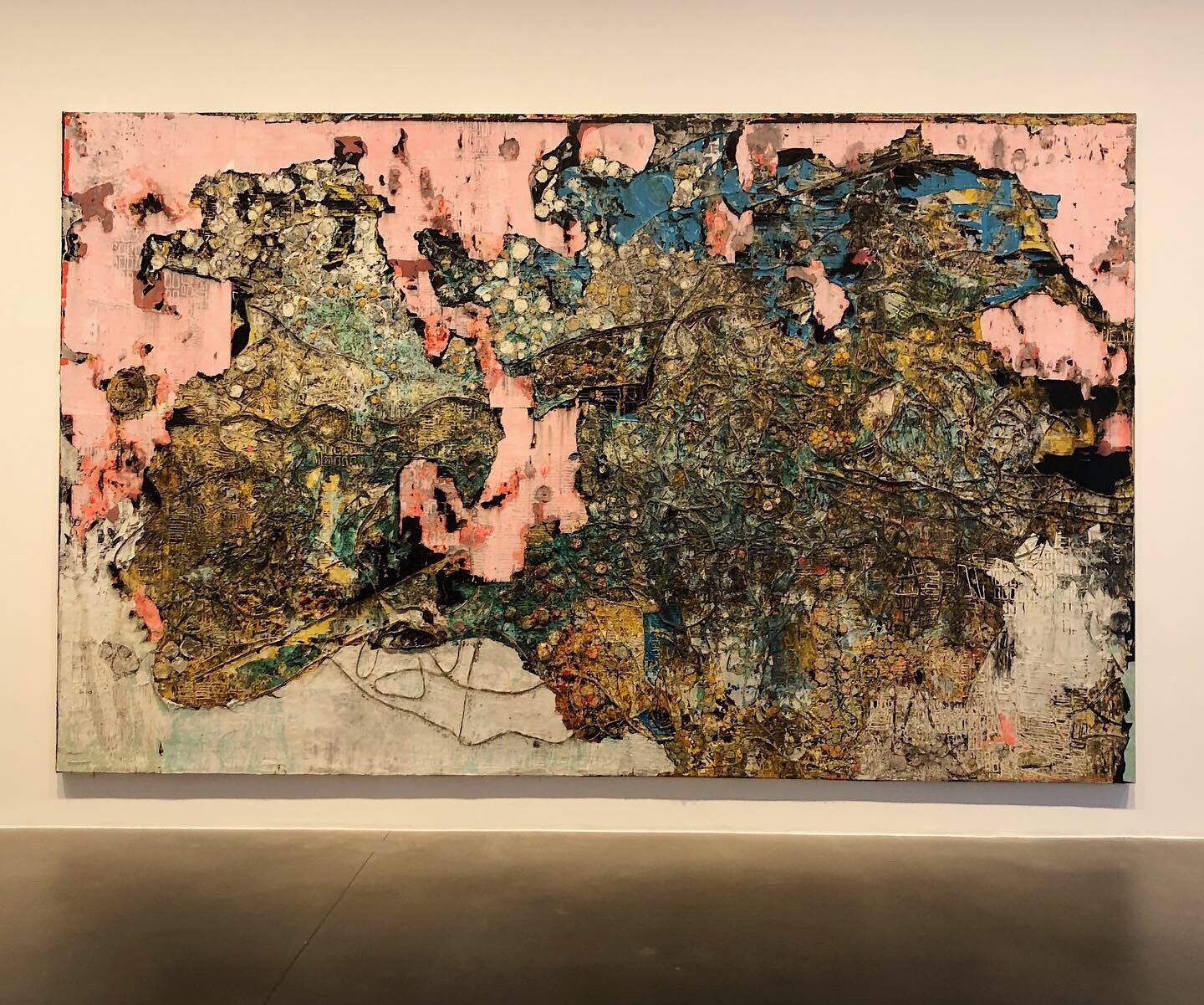
Seeing Mark Bradford’s solo exhibition, “Cerberus,” at Hauser & Wirth was a gift of inspiration that I am still revisiting in my head. It was the type of experience that can make an entire journey worth the effort.

Part of prioritizing is paying attention to your budget. For most places I have traveled in Europe, museums can average 10- 20 euros for an adult ticket. Many times I’ve had to skip the fancy dinners and opt for cooking the same cheap and boring meals to afford the museums.

Lucky for me, one of my favorite museums, the Tate Modern is free (minus special exhibitions).

If you aren’t traveling solo, be mindful of who you are traveling with and be courteous of their needs too. If I am traveling to visit friends and their baby, decisions are made around nap time.

IMG_8862 2.jpg

If you are traveling with your mom, walk slowly and hold the umbrella when it rains. Laugh with her when you stand too close to the street and a car drives by, splashing a puddle over your heads.

list 3 copy.jpg

Detour when needed.

Even though I just said it is good to plan & prioritize, I think it is just as important to ditch the plan and leave room for the unknown. If you see something that you find interesting, stop and investigate.

Golden Light, London

Mindfulness is eyes wide open.

“Go outside into the world and be mindful of what you see…practice listening to sounds, looking up to the sky and down to the ground, and zooming in on things you would not see otherwise.”

-Lisa Congdon, Find Your Artistic Voice

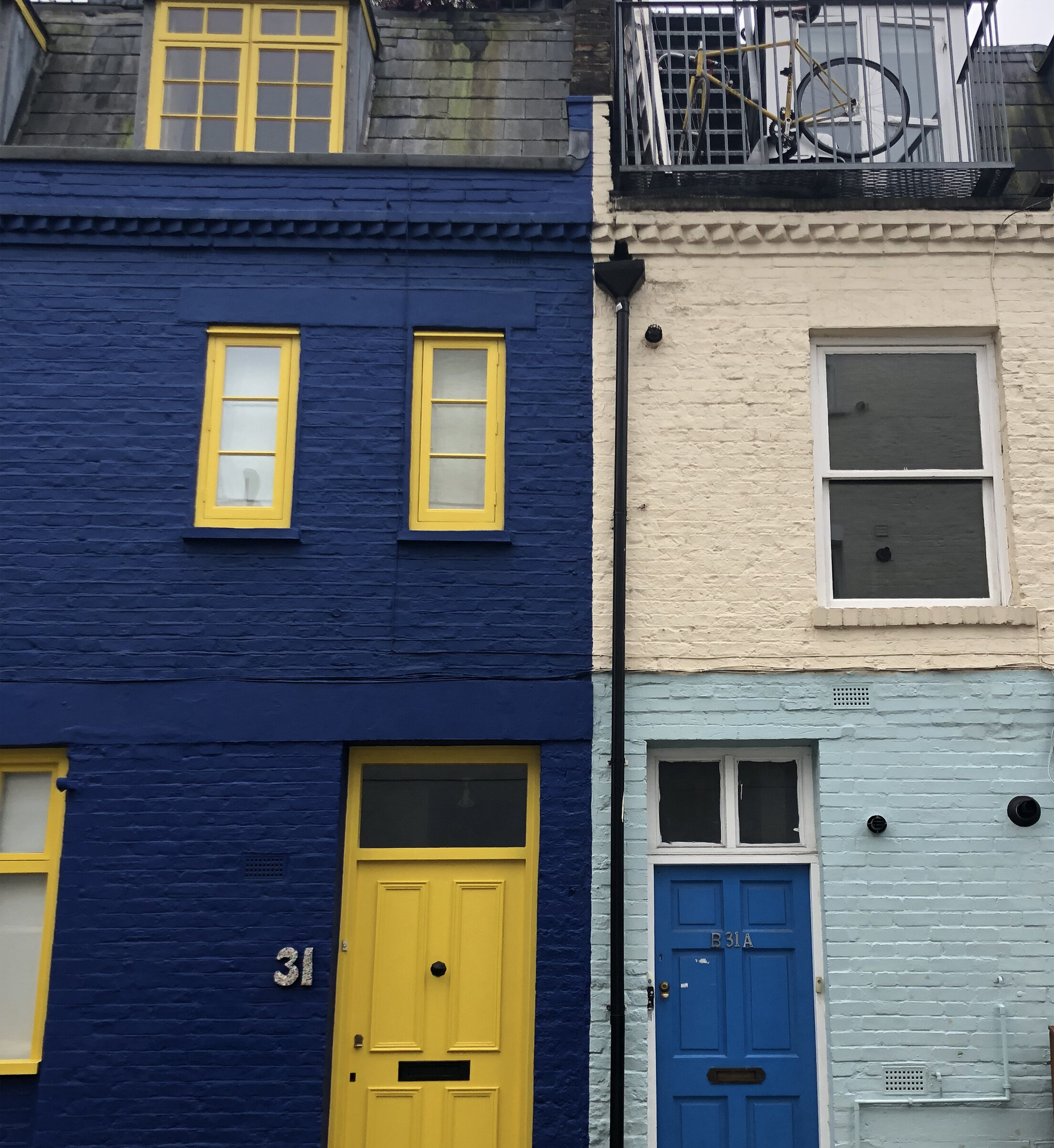
Whether I am in London or anywhere for that matter, I tend to navigate towards the bright colors - old things made new.

If you pay close enough attention, sometimes you encounter signs that signal more than just what is visible on the surface - little reminders of why you came to find yourself in that spot - like the sweet encouragement of a smiling blue bird, when you are feeling lost.

list 4 copy.jpg

Make safe choices.

This one seems obvious, but more times than not I have gotten myself into tricky situations by making poor judgements. After getting lost in Tel Aviv with little cash and no phone, I always travel with a spare charger and spare change hidden inconspicuously.

In general, be aware of your surroundings and trust your instincts, especially if you are a woman traveling alone.

Beach Patterns, Tel Aviv

Luckily, I was able to retrace my steps, following the coast with a collection of landmarks and the help of a kind taxi driver that accepted to take me as far and as close to the beach as my limited funds would afford.

Sea Glass, Tel Aviv

In the end I learned my lesson and traded bread crumbs for sea glass, finding my way back again.

list 5.jpg

Recharge

Don’t forget self care.

Piazza San Marco, the most expensive place to drink a cappuccino

Sometimes I get caught up in the adrenalin of a new place and I have to remind myself to hydrate, stop and eat regularly, not just caffeine & sugar.

But if you are in Vienna aka the land of sweets, you must try the cake.

list 6.jpg

Document

Record your adventures.

My grandad and now my dad, travel everywhere with their video cameras. I appreciate the opportunity to go back in time through their eyes.

From the home video collection: Grandad’s musical montage of traveling in Europe with family commentary as an added bonus

I like to take pictures and write about what I couldn’t capture in film. I record the names of the restaurants, parks, shops - listing the places that stood out to me or the shape of the clouds in the sky.

If time allows, I like to draw, capturing my squiggly interpretation of the details within my view.

I also keep unexpected souvenirs: an emptied mini jar of jelly refilled with sand, vintage tin cans, a box of purple matches, a ball of thread, striped rocks, a piece of a broken roof tile, found wood shaped like a wishbone, beach plastic or stolen spoons.

A collection of souvenirs

(EDIT: Recommended read - additional insightful considerations for travel,“Should There be a Universal ‘Code of Conduct’ for Travelers?” written by Sally Kohn.)

A Year of Sunrises

A collection of seasons and their sunrise.

Nov 18th 2018 713 copy.jpg

Nov 18th 2018 7:13 am

Nov 23rd 2018 810 am.jpg

Nov 23rd 2018 8:10 am

Nov 29th 2018 8 am .jpg

Nov 29th 2018 8 am

March 6th 649 copy.jpg

March 6th 2019 6:49 am

Sept 16th 654 copy.jpg

Sept 16th 2019 6:54 am

Oct 30th 715 copy.jpg

Oct 30th 2019 7:15 am

oct 31st 711.jpg

Oct 31st 2019 7:11 am

Screen Shot 2019-11-10 at 10.27.26 AM copy.jpg

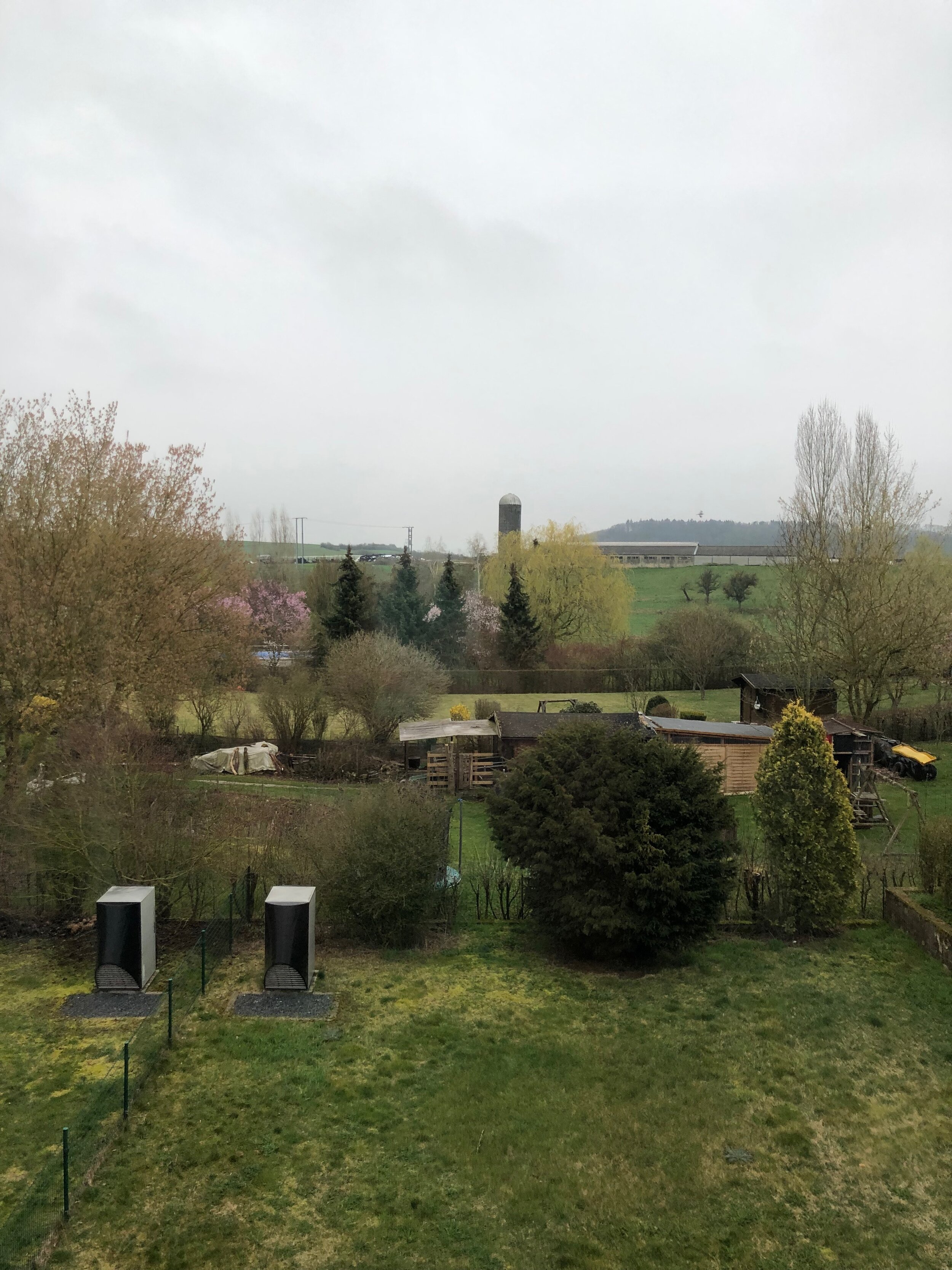
Everyday I wake up to the rolling hills of a farm behind my house slowly creeping into view, admiring the sky’s ever changing blue.

“The world is blue at its edges and in its depths…

For many years, I have been moved by the blue at the far edge of what can be seen, that color of horizons, of remote mountain ranges, of anything far away. The color of that distance is the color of an emotion, the color of solitude and of desire, the color of there seen from here, the color of where you are not. And the color of where you can never go. For the blue is not in the place those miles away at the horizon, but in the atmospheric distance between you and the mountains.”

-Rebecca Solnit, A Field Guide to Getting Lost

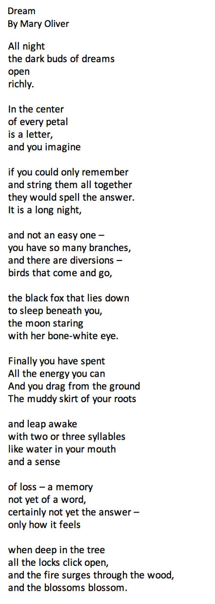
dream.jpg

Sometimes dreams come true.

Copenhagen: A Field Study

The last time I created a field study notebook was in undergrad at UNCC. I had taken art history classes in NYC and London and the final assignments were detailed notebooks of your findings.

Side note: I fell in love with the work of artist Storm Tharp (flyer pictured above), who is based in Portland, Oregon. It began my curiosity of the Pacific Northwest, where I eventually lived for six years.

In theory, the idea of continuing to chronicle my travels post graduation was always a goal, but unfortunately, the reality has been that the project always got buried in my to do list.

It wasn’t until recently that I was inspired to revisit the idea after learning of the late Danish artist, Per Kirkeby. Currently, on exhibit at the Statens Museum for Kunst, are his series of collages from his project Field Books.

As a trained geologist and artist, he would travel with a notebook, using a variety of media to sketch his observations. For Kirkeby, his diverse subject matter was often themes such as architecture, trees, drawing techniques, erotic motifs or maps.

I started by creating collages on the go. I made a sight specific series of scavenged squares in different scenarios.

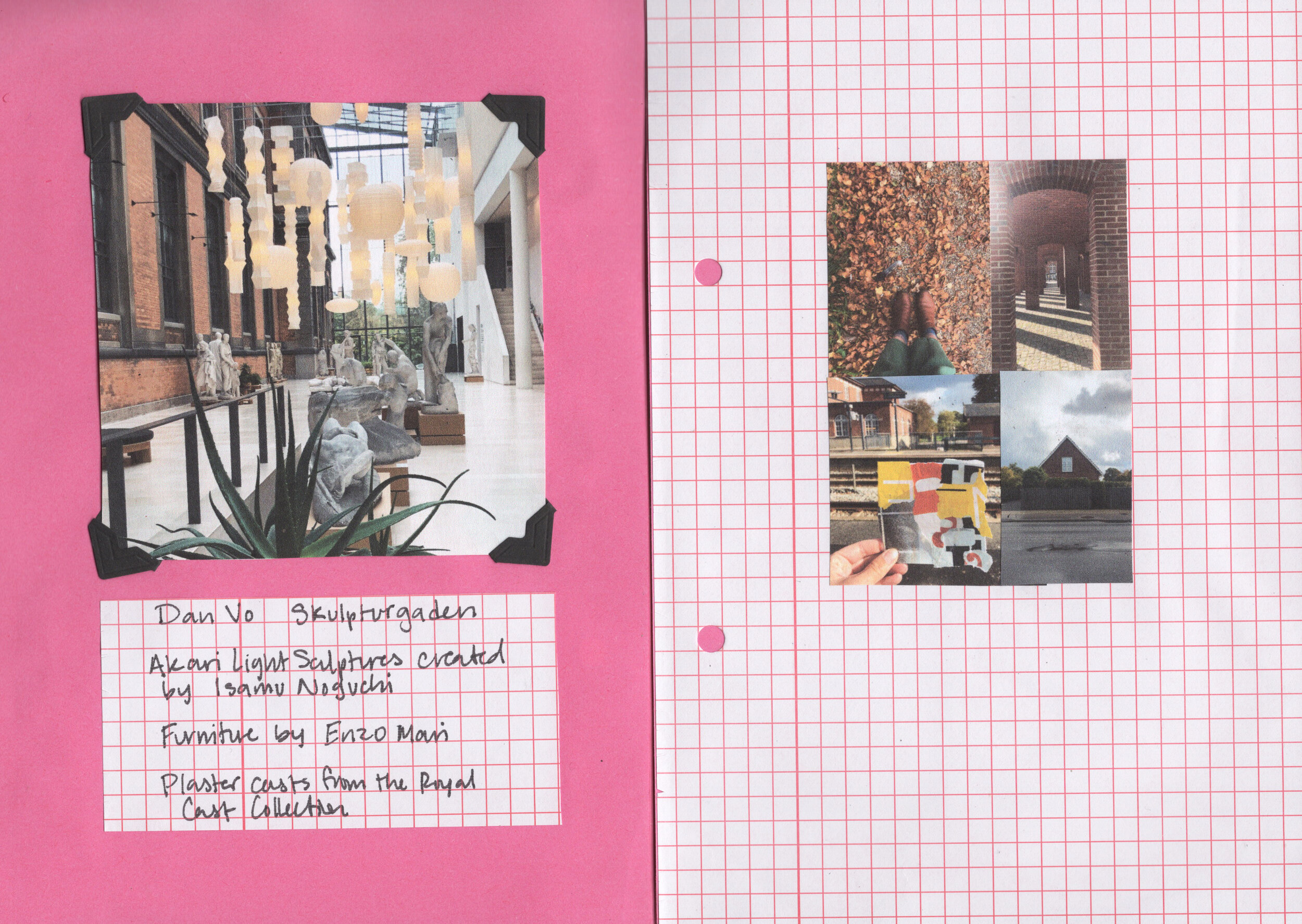
Each location is part of a collection of observations bound in a little pink book.

#1: Nyhavn Townhouses

#2: Parks, Gardens & Cemeteries

Superkilin Park (designed by Superflex), The King’s Garden, Assistens Cemetary & Frederiksberg Park

#3: Svanemølle Beach & Torvehallerne Market

#4: Louisiana Museum of Modern Art

The Louisiana Museum of Modern Art is named after a man with three wives, all of them named Louise.

#5: SMK Museum - Asking important questions

#6: Galleries: V1, Gether Contemporary, & Bo Bjerggaard featuring favorite find - Peter Linde Busk

#7: Coco the Cat in Copenhagen

Stayed at an Airbnb with a cat named Coco.

#8: Design Museum

#10. Rundetaarn (The Round Tower)

Europe’s oldest Observatory

May You Live in Interesting Times

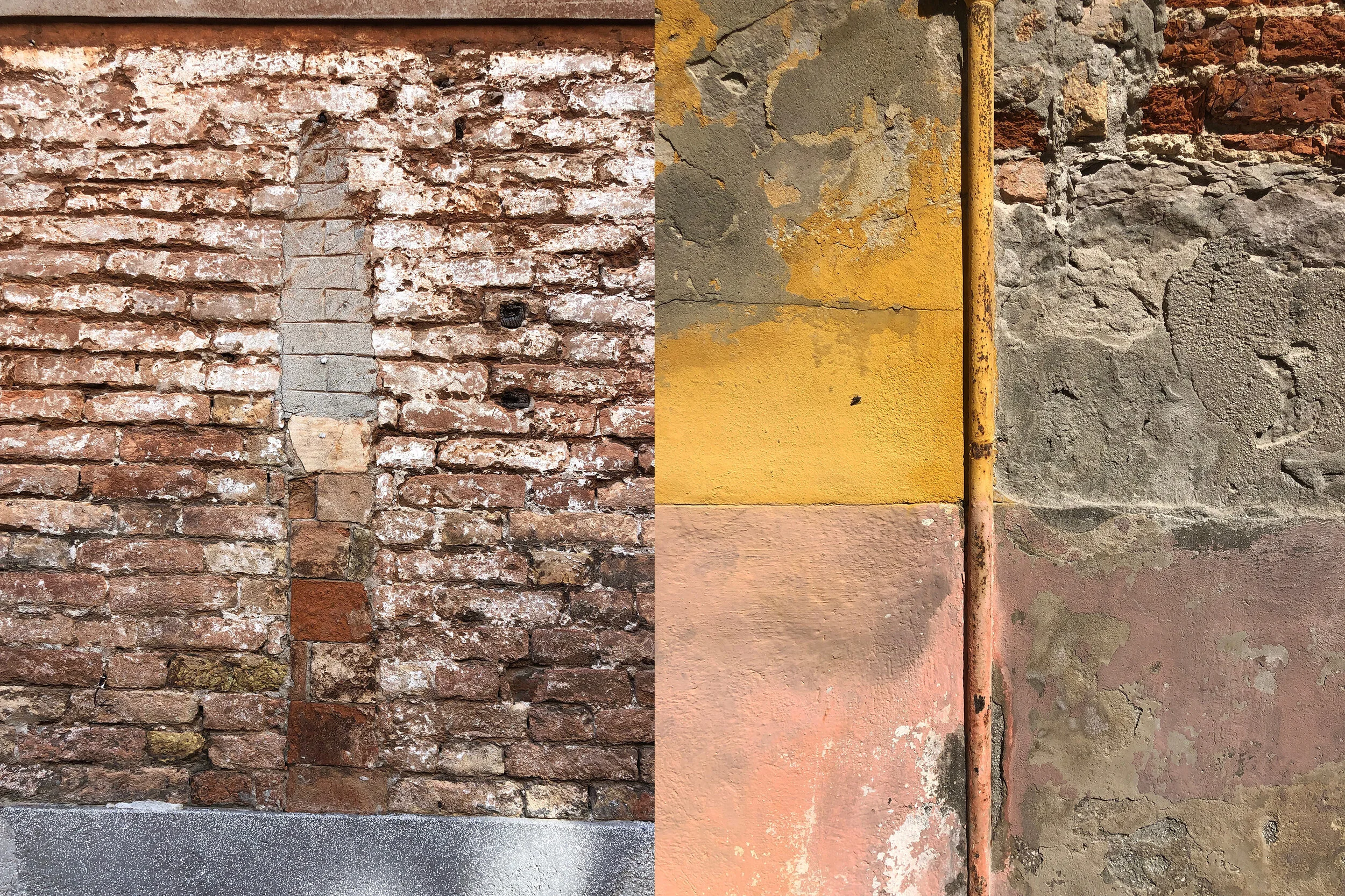
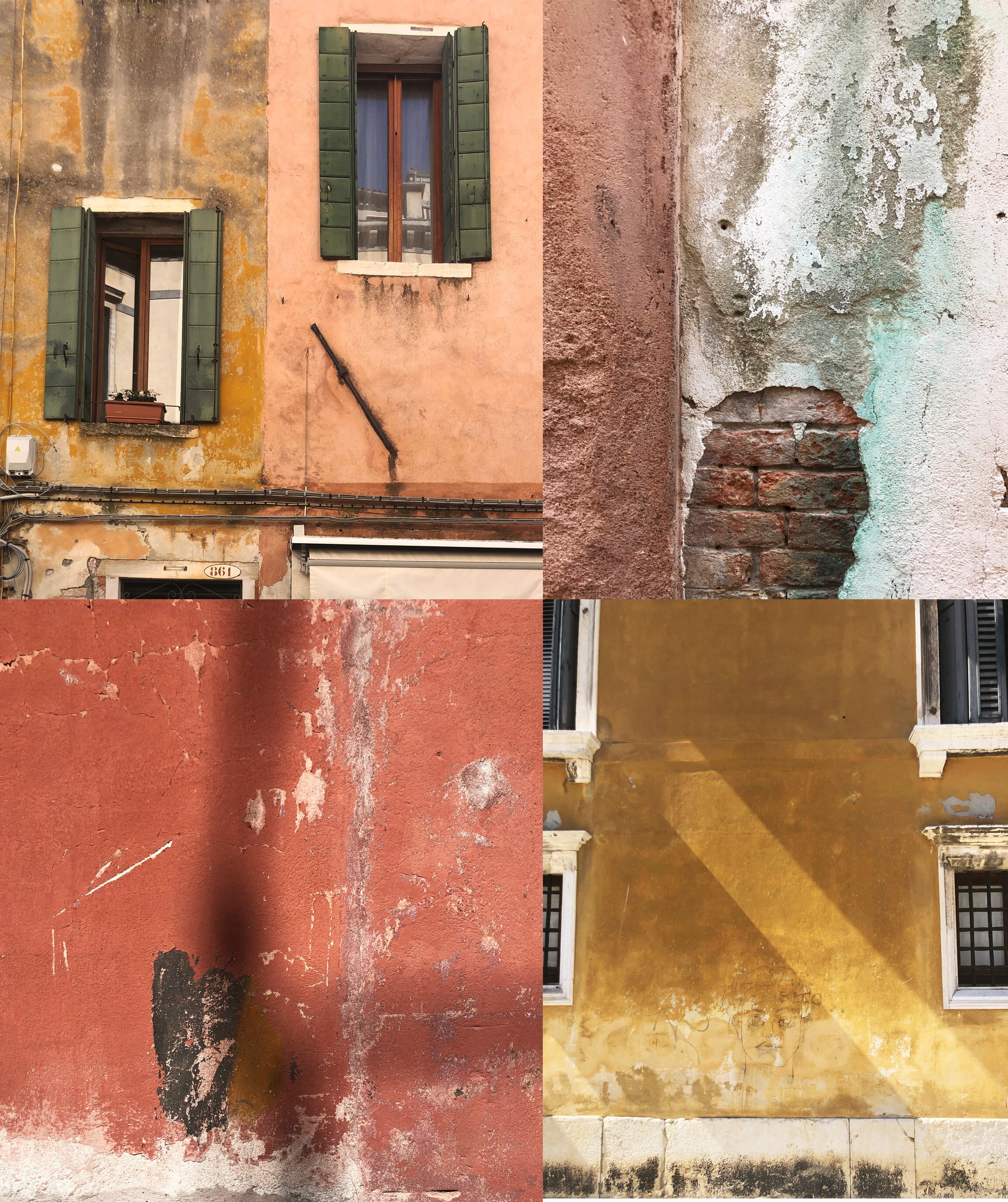
The floating city of Venice, Italy is a living museum of found paintings.

A Collection of Walls Found in Venice, Italy, September 2019

I found the walls in Venice to sit proudly in elegant decay, wearing their histories in the patina and faded colors of peeling and chipped paint with poignant adversity.

The resulting textures mark the passage of time and the effects of an incessant number of tourists and the dangerous rising water of the Adriatic Sea’s high tide.

Out of one of the few newspapers I found written in both Italian and English, I read an article, “Venice 2019 Annual Report,” by Gherardo Ortalli, reporting that per one Venetian resident there are 358 tourists, myself included.

Like many other tourists, my reason for visiting was to see the Venice Biennale, aka the Olympics of art. Held biannually in odd numbered years, La Biennale Di Venezia dates back to 1895. Now in 2019, this contemporary art exhibition features a continually growing number of international artists, with more countries installing their own national pavilions.

At the 58th National Art Exhibition (11 May - 24 November 2019), titled, “May You Live in Interesting Times,” I noticed a theme of responses to both climate change and migration.

El Anatsui, is one of six featured artists housed in the Artiglierie section of the Arsenale at the Ghana Pavilion.

Well known for his shapeshifting tapestries of smashed bottle-caps and other recycled detritus, Anatsui’s largest piece featured at the pavilion is a vivid yellow, larger-than-the-wall piece, that references the damage gold panning has wrought on Ghana’s rivers.

Throughout Anatsui’s work there is a clever multi-faceted use of material that simultaneously comments on reclaiming discarded goods out of necessity while referencing both political and historical concerns.

Even his use of cropped text from salvaged aluminum, cites Nigerian liquor companies and alludes to the dark history of Colonialism within the production of rum.

The theme of climate change was addressed directly at the Nordic Pavilion’s exhibition, “Weather Report: Forecasting Future.” Featured above is the work of the artist collective, Nabbteeri, and Ingela Ihrman.

“ It is often difficult for humans to notice life that exists on a scale different from theirs, such as microscopic organisms, the slow workings of toxic agents or durational processes of decaying organic matter. The exhibition attempts to establish a connection with more-than-human agencies by heightening the visitors’ awareness of the materiality, including that of the space and the artworks, and by assimilating their bodies to other life forms.

-Curatorial Statement by Leevi Haapala & Pila Oksanen

Artist, Laure Prouvost featured at the French Pavilion, presented “Deep See Blue Surrounding You / Vois Ce Bleu Profond Te Fondre,” as what I interpreted as a response to the location of Venice as a floating city, surrounded by water.

The exhibition requires you to enter from the basement at the back of the building, leading you up a staircase to a brightly lit room filled with glass imitations of trash imbedded into the sea-like floor. In my book, Prouvost won the award for creating the most encapsulating multi-sensory environment filled with surreal immersions of projected moving images and sounds.

“Written in Water,” by Marco Godinho at the Luxembourg Pavilion also comments on the theme of water and man’s use of the sea to migrate.

Seascapes become mindscapes, metaphors and memories of journeys both traveled and not.

Christoph Büchel’s Barca Nostra at the Venice Biennale

Controversially addressing migration via sea, is Swiss artist, Christoph Büchel’s project “Barca Nostra,” featuring the shipping vessel that sunk in 2015 while carrying hundreds of people fleeing Libya to Italy.

The choice to display the boat as part of the Biennale has been criticized on a spectrum of grossly insensitive to “a sign of signs.” British art critic Matthew Collings explained in the Evening Standard, that the boat’s presence is a symbol of privileged exploits and the continually increasing migrant crisis.

“Venice is replete with visible reminders of militarism, colonialism and looting. The Arsenale is where Venice’s coast guard is based. One of their tasks is to keep migrants out.

Found at the off sight exhibition, “Personal Structures,” Federico Uribe, transforms two entire rooms with his installation, “Plastic Reef.” It’s purpose is obvious, but the sheer amount of tiny bits of plastic texture still manages to surprise you.

The only thing not surprising was encountered this exhibition at the same time as a class of lower school students.

Otobong Nkanga at the Giardini

Otobong Nkanga is one of my favorite finds at the Giardini.

“She describes her drawings as coming from a place of imagination; where realities that are happening in multiple places can intersect. Yet, while her approach may be imaginative, her subjects also reference the very real (and often violent) movement and exchange of minerals, energy, goods and people. They are a reminder that objects and actions do not exist in isolation: there is always a connection, always an impact.”

-Curatorial Statement from the Giardini

Not all of these profiled pieces are works that I enjoyed, but after experiencing them at the Biennale, I’m still thinking about them now.

And I hope that today, as people around the world participate in youth led protests against climate change, that you will also think about your part in what you can do to help.

Places Where Two Ends Meet

Corners are a spectrum of dichotomies. They exist in the crossroads and the pull of two places; forming the transitional space where decisions are made.

Kayaking between two countries, counting the bridges that connect them, 2019

As physical markers for navigation, corners represent the end and the beginning. Like chapters with sharp edges, filled with folded creases, bookmarking pivotal passages. Corners have two sides - life achievements and tragic disappointments.

Corners converge in physical and metaphorical space. Manipulated in everyday language, they become nouns, adjectives and verbs that turn phrases into different meanings. Backed into a corner, you can find yourself confronting your worst fears, trapped, with no way out.

But around the corner, you might find a safe space or a secret in the corner of your eye; a quiet nook built with dreams. Turning corners is the possibility of confronting either, while cutting corners are the risks we take to get there.

For me, my studio corner exemplifies the creative struggle, a place where every type of corner is possible.

The Creative Struggle is a Maze of Corners, 2019

Changing Landscapes

We aren’t the same people we were when we first started dating.

The changing landscapes we have experienced together have shaped us into better versions of ourselves.

Double Exposure Porch Portrait, Digital Collage, 2019

Sometimes I wonder if the younger me would even recognize who I am now, but I think a part of me always knew these aspects of myself I needed to see.

My Body, My Home, Digital Collage, 2019

“…Sometimes my own body seems like a home through which successive people have passed like tenants, leaving behind memories, habits, scars, skills and other souvenirs.”

-Rebecca Solnit, A Field Guide to Getting Lost

Looking Within, Digital Collage, 2019

“Home, I said.

 In every language there is a word for it.

 In the body itself, climbing

 those walls of white thunder, past those green

 temples, there is also

 a word for it.

 I said, home.”

- Mary Oliver, “The River”

Searching the Sea for Secrets, Digital Collage, 2019

Its a strange feeling to split your heart and home into multiple places and feel the distance between them.

Yet, its because of that distance that I’ve been forced to grow. Sometimes it is ugly, lonely and depressing. And sometimes it is a gift, like the surreal feeling of being dwarfed by mountains or a never ending sea; to lose count of the gradients of green swatches that run off, winding around a curve.

The Green Places I’ve Lived, Digital Collage, 2019

As I’ve learned the effects of different environments on my psyche, I’ve found its greenery that rejuvenates my soul.

Switzerland’s mountains and lakes reminded me of how much I loved living in the Pacific Northwest, near water and forever chasing a clear view of the iconic Mount Rainier, Washington’s active volcano standing majestically 14,410 feet above sea level.

What places have changed you?

Painting with Words

I’ve always been interested in typography and admire the art of arranging and designing letters.

A combination of three dimensional letters and flat graffiti against a tile grid

It wasn’t until I heard the phrase, “typography is painting with words,” on Netflix’s episode six of the documentary, The Art of Design , that I began to identify why I like to collect found type.

Graphic designer, Paula Scher’s definition of typography is her passion. She is literally a painter of words and in some round about ways, so am I.

Throughout the episode, Scher discusses why she has made a career in “making type talk.” She explains the differences in weights and heights and the power of these measurements to link a letter to a specific time period.

The different impact of letters

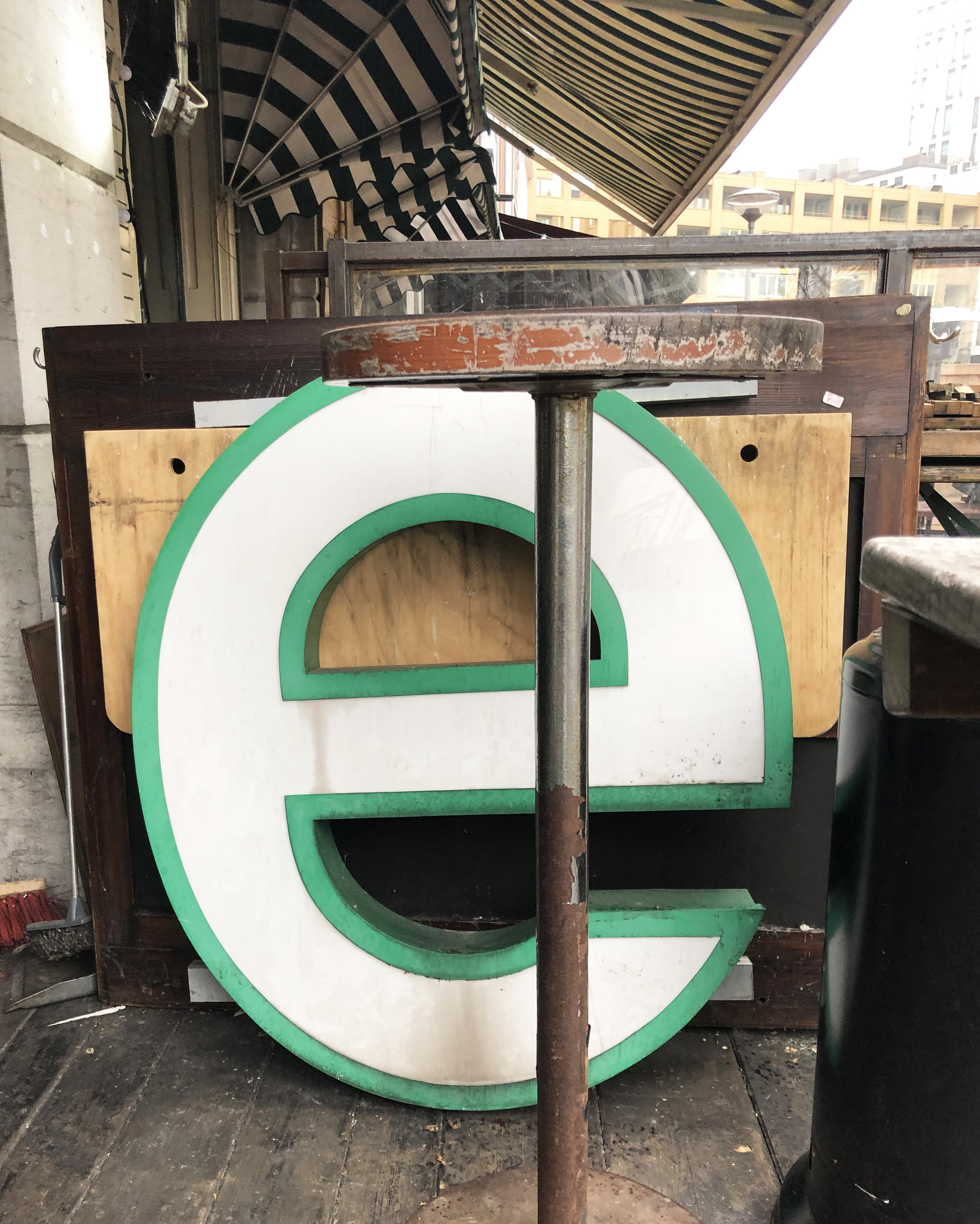
She cites the height of the middle bar of the letter “E” as an example. If the middle bar is raised, it is a reference to Art Deco design of the 1930s.

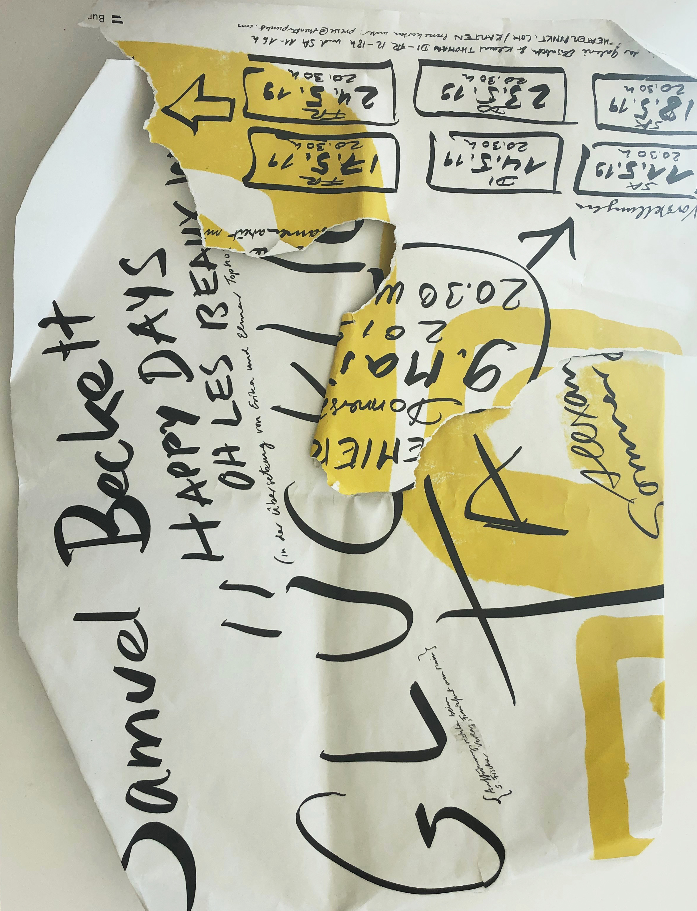
Found upside down type at Naschmarkt, Vienna

Found upside down type at Naschmarkt, Vienna

In my thirty minute introduction to Scher’s work, I came to understand her design to be driven by the challenge of creating letters that are paired with meaning to create an impact in real life.

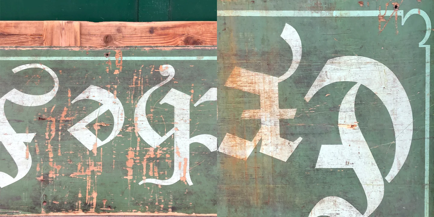
German type

My challenge with the letters that I find in real life places like Vienna, Paris, Rotterdam or Tel Aviv, is that I cannot read German, Hebrew or Dutch and unfortunately my French comprehension is so minimal, that I am nervous about my final exam.

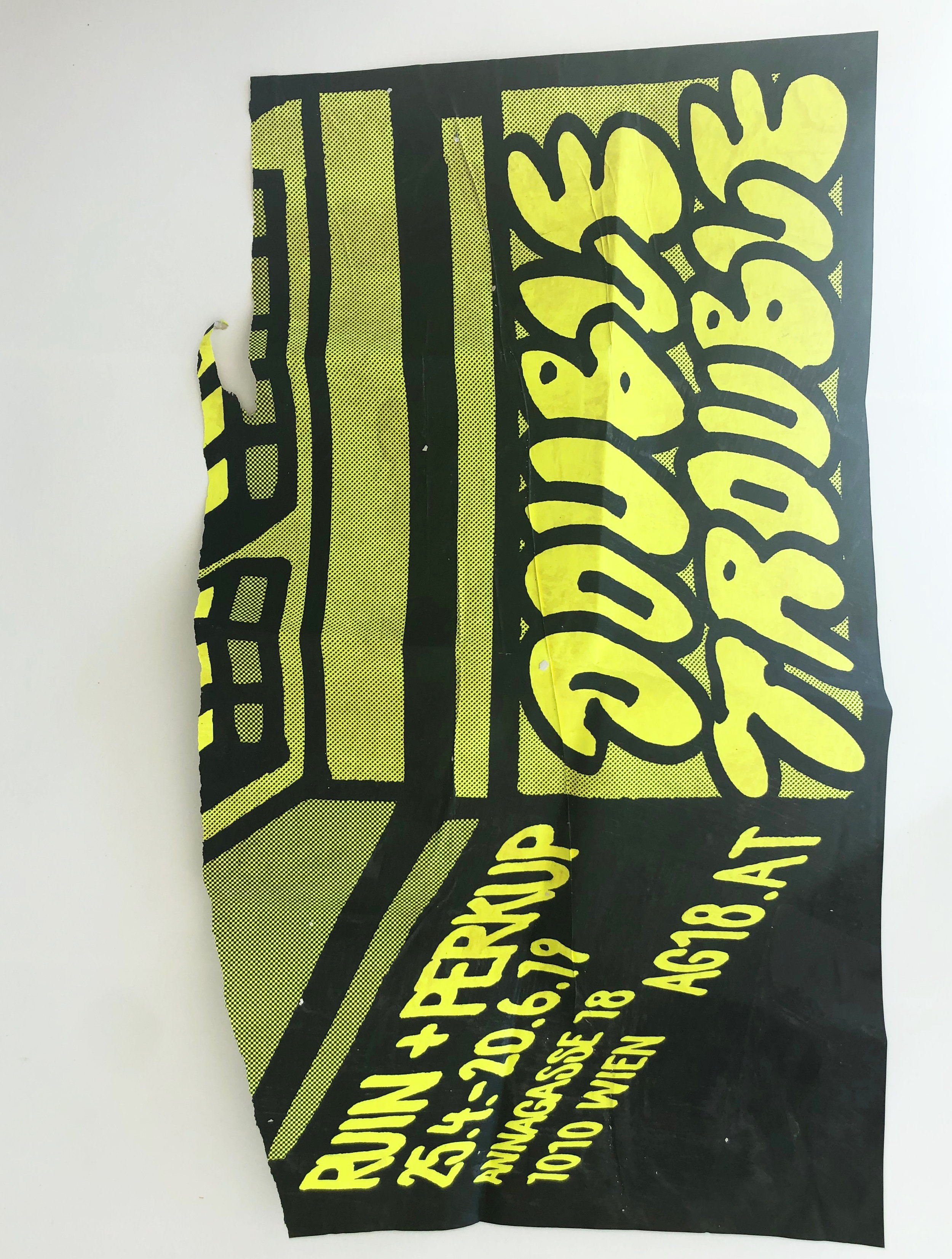
This means more times than not, I am relying on the quality of design to provide information regardless of my language barrier. Out of necessity, I am studying font for it’s characteristics. I pick up advertisements and stop to take a photograph for the same reason. I respond to which type talks to me in my visual language.

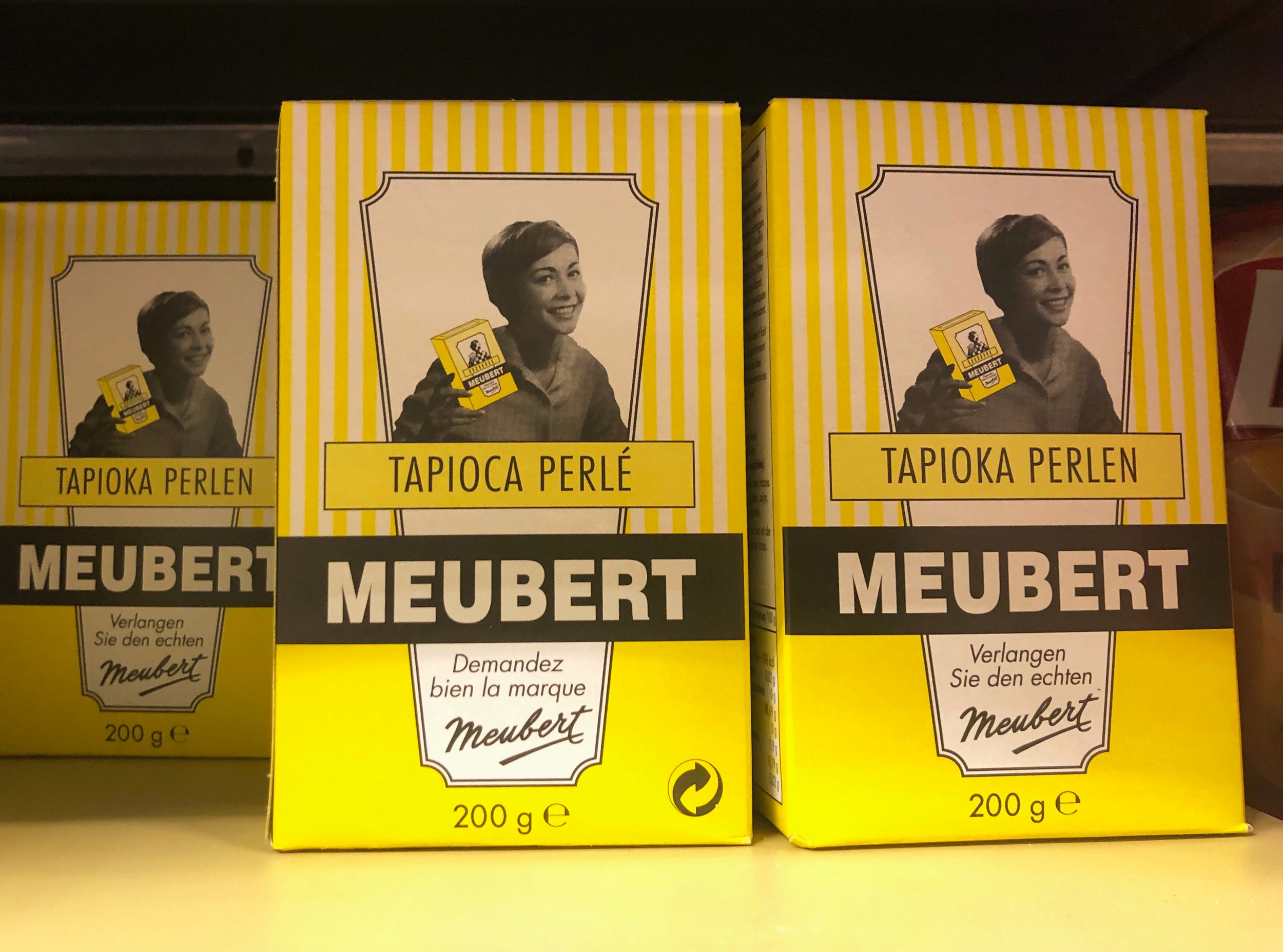
Take the company Meubert for example. I am drawn to their retro packaging, yet it gives me no clues as to what the product is.

Comparisons

Most of the time it is a shape or form, sometimes it is color, texture or the latter that catches my attention.

Good design can make me be that weird person that gets stared at for taking a picture of an everyday, seemingly unimportant sign or tearing advertisements off a pole and stuffing them in my bag.

Oddly enough, while I was wondering through Vienna a few months back, already in the midst of collecting found type, I stumbled upon an exhibition at Georg Kargl Fine Arts, focused specifically on typography.

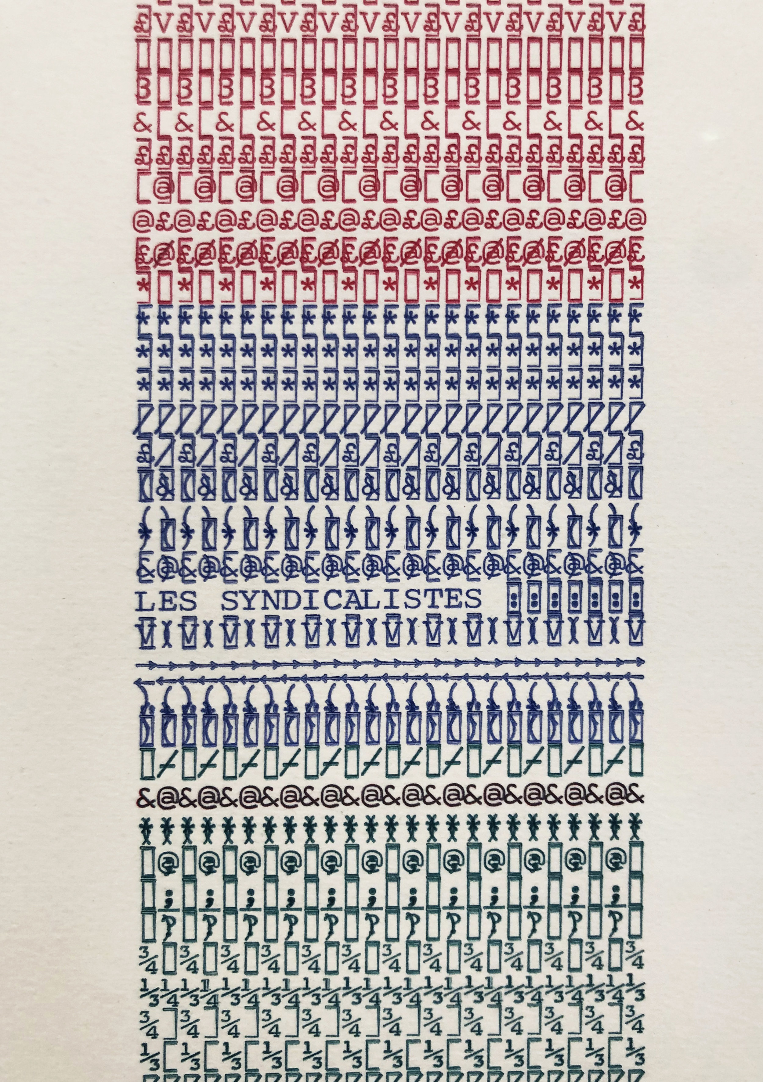
Lutte Poétique by the late Henri Chopin featured a series of abstract works on paper created with type as the primary medium and subject.

Chopin’s typewritten arrangements use letters, characters and numbers formed in a nonsensical system. When linked together within layers of repetition, they create a different kind of language, legible only in a visual sense.

This is a concept, I have recently been exploring in my own work. As a way to help me process the overwhelming feeling of working through language barriers, I have begun to exploit these emotions by working within a set of limitations that mimic a similar impediment.

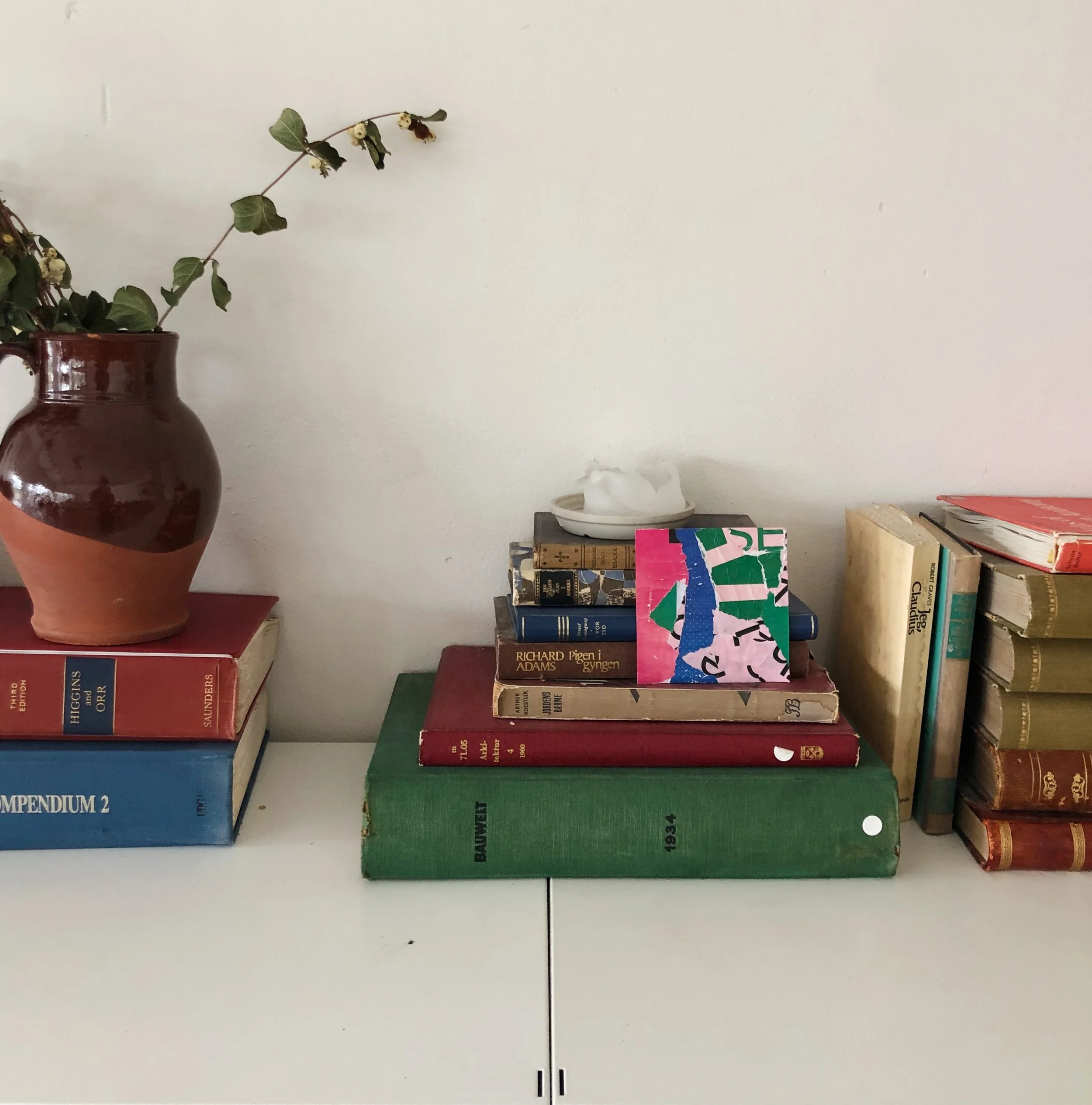
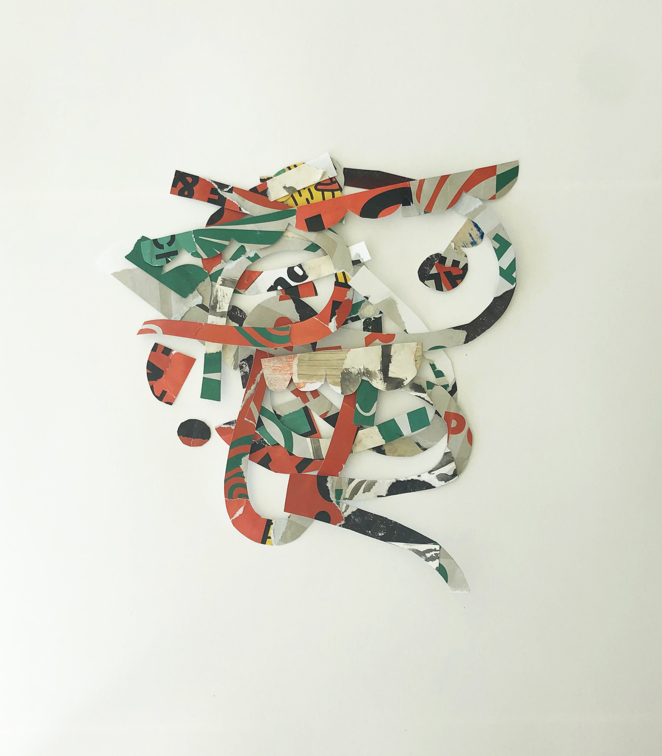
I start by using selected advertisements to construct a collage. Afterwards, I conceal my work from myself by turning it upside down. While the collage is hidden from my view, I cut and crop shapes that I use to assemble new designs.

By creating a “blind collage,” I am withholding information from myself as a challenge to work within the unknown. One result from this process is a two sided accordion book.

Rather than using identifiable text to create abstract imagery, I am rearranging and assembling letters to create new designs that may or may not reveal their original context. It is the history imbedded in each letter’s gesture that I am interested in keeping.

Side 1 of the accordian book

I may not be a painter of words in the same literal sense that Paula Scher created her typographical map paintings, but I use type as an entry point for creating. My paintings are a different type of site specific map.

Currently, my most recent series, “Remnants Dipped in Bleu,” is on view at Bloom Luxembourg from Avril 13 à Juillet 2.